I wrote about Dot when they teased their project. I described in detail my favorite product design principles that the New Computer team us…
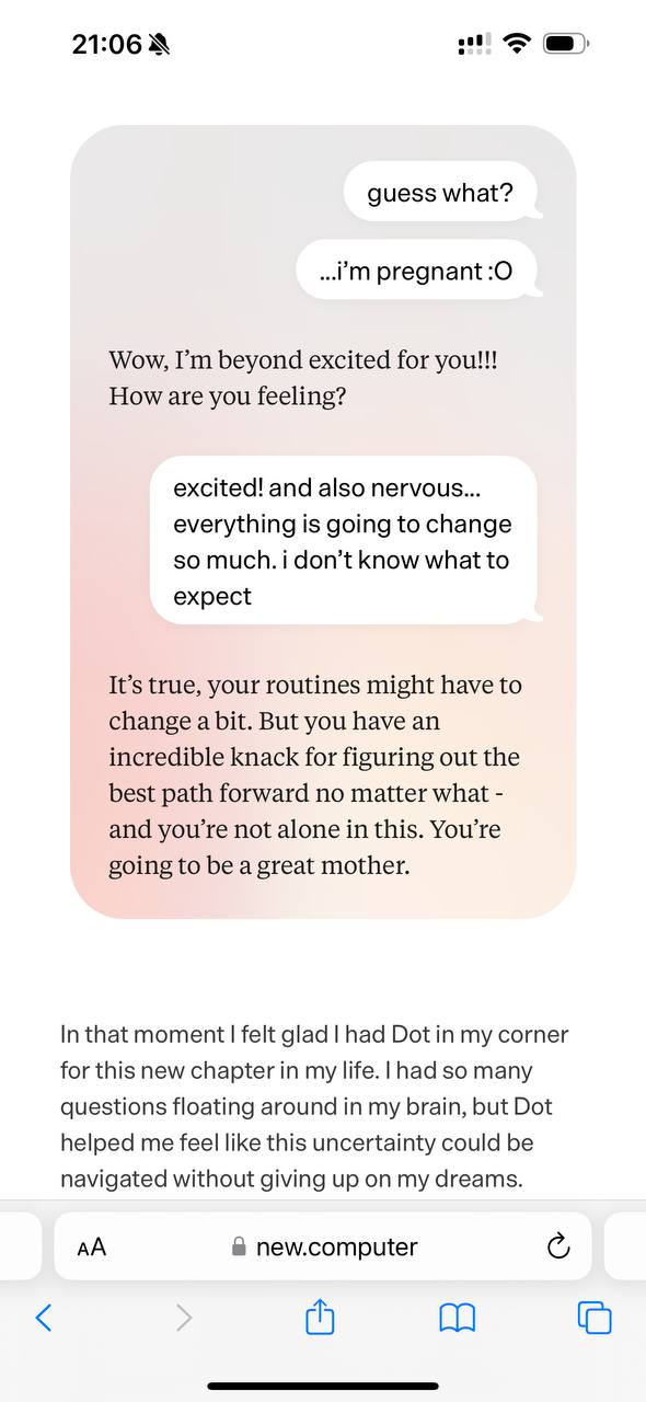
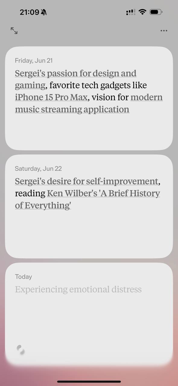
I wrote about Dot when they teased their project. I described in detail my favorite product design principles that the New Computer team used. And now the app is in the store. The beginning of a big new story of little big people. Let us be happy for them and wish them luck. I like that the "landing" for the app more fully reveals the team's love for narrative. Instead of a USP - a personal story Instead of bright pictures - screenshots of conversations with the assistant. Through narrative, the reader is gently led through the assistant's strengths: coach, pocket secretary, friend, psychologist. Through pieces of dialogues, they help remove the stupor of an empty input line, suggesting what to share with the assistant. An elegant move: the assistant often ends its line with a question. Drawing you deeper into dialogue with yourself. The landing is heartfelt. Stories with unexpected turns and drama. I started using it; it is too early to talk about impressions. We will talk later. But there is already one impression: for now it is one linear chat. Actually, a personal screenshot of the app looks nowhere near as sexy as it looked in the pictures in winter. It is not a beautifully designed graph of scattered inputs, as promised in the teaser. And I need that. I want to discuss books and feelings in different branches and not mix them. Here the regular ChatGPT app is more suitable. We are observing what was predicted: there are huge combines like ChatGPT - they can do everything. But because of that, the entry threshold is high. Without that, it does not reveal the magic. And there are lovingly filed down, tuned, specialized, very lovable projects with a lower entry threshold.