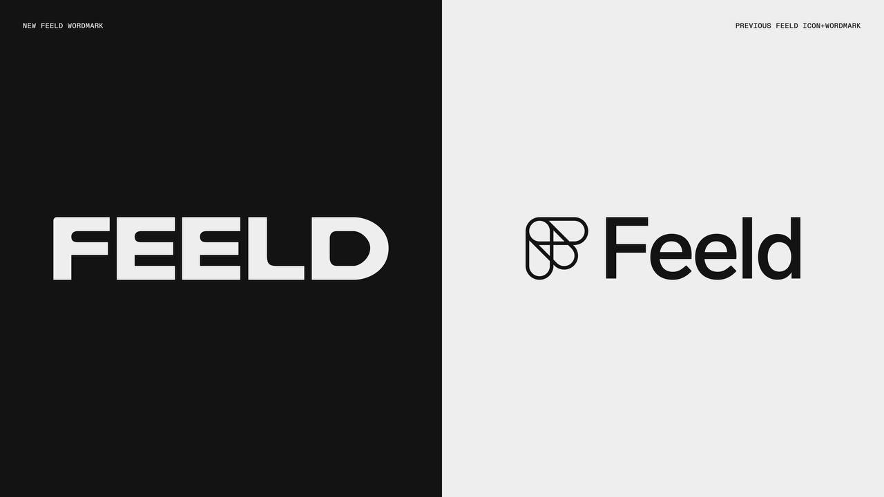
Another redesign! Feeld updated. Also an icon on a black background (yes-yes, it is dark-dark gray, like Batman's suit). New Edge 666 looks…
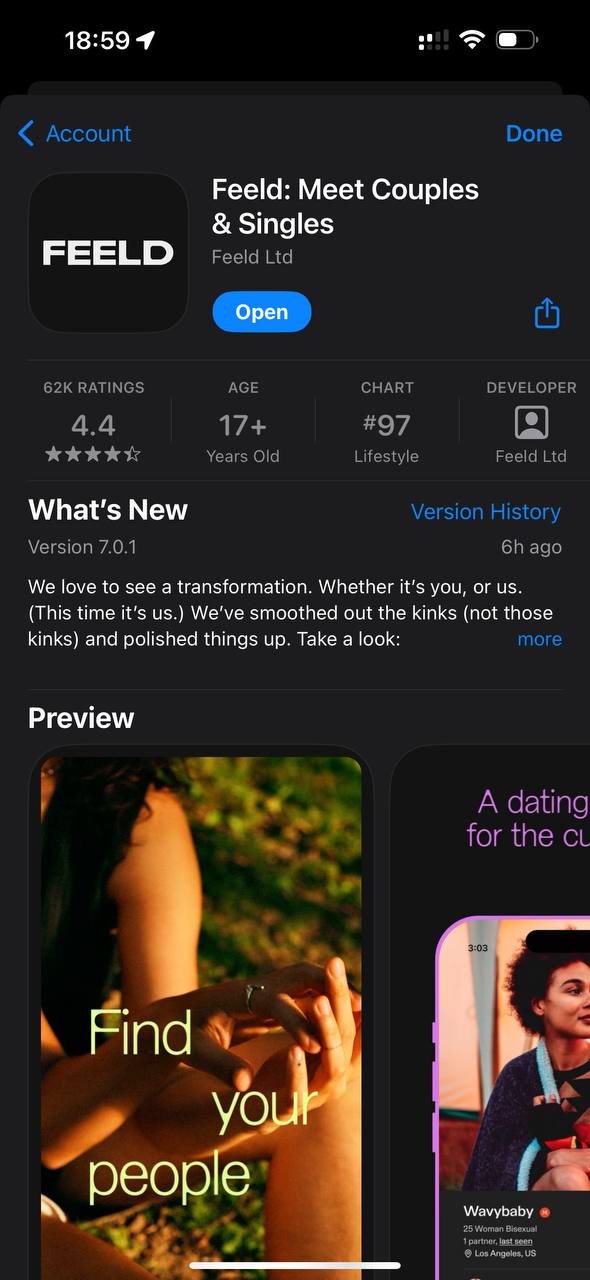
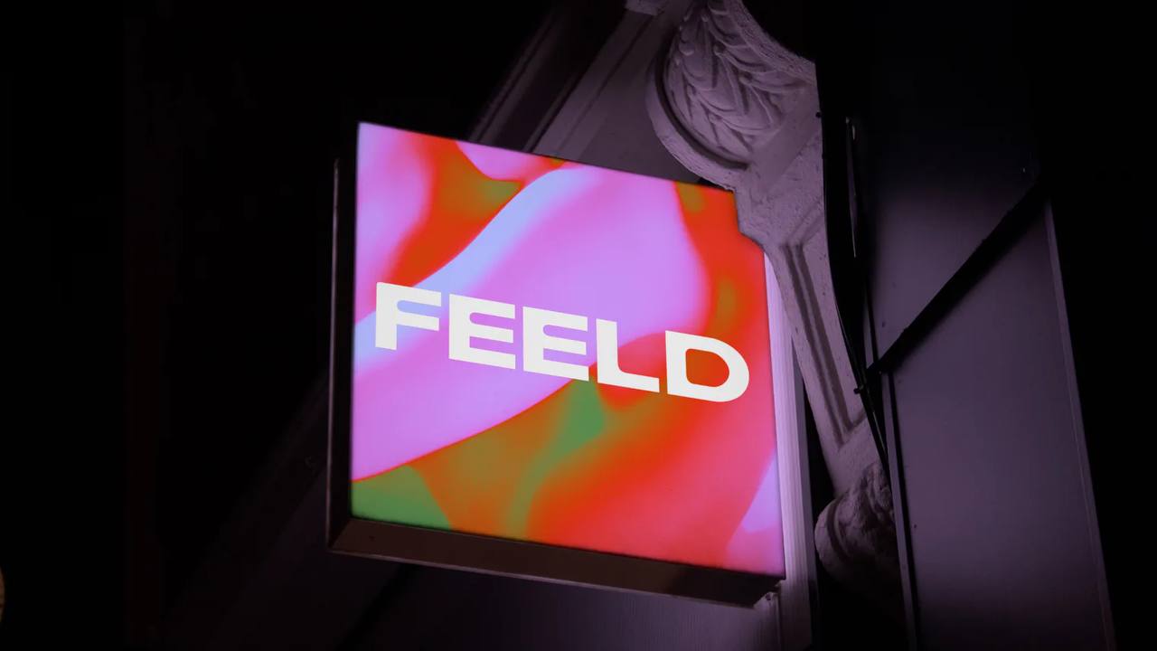
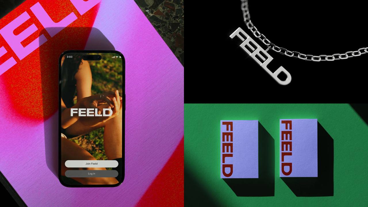
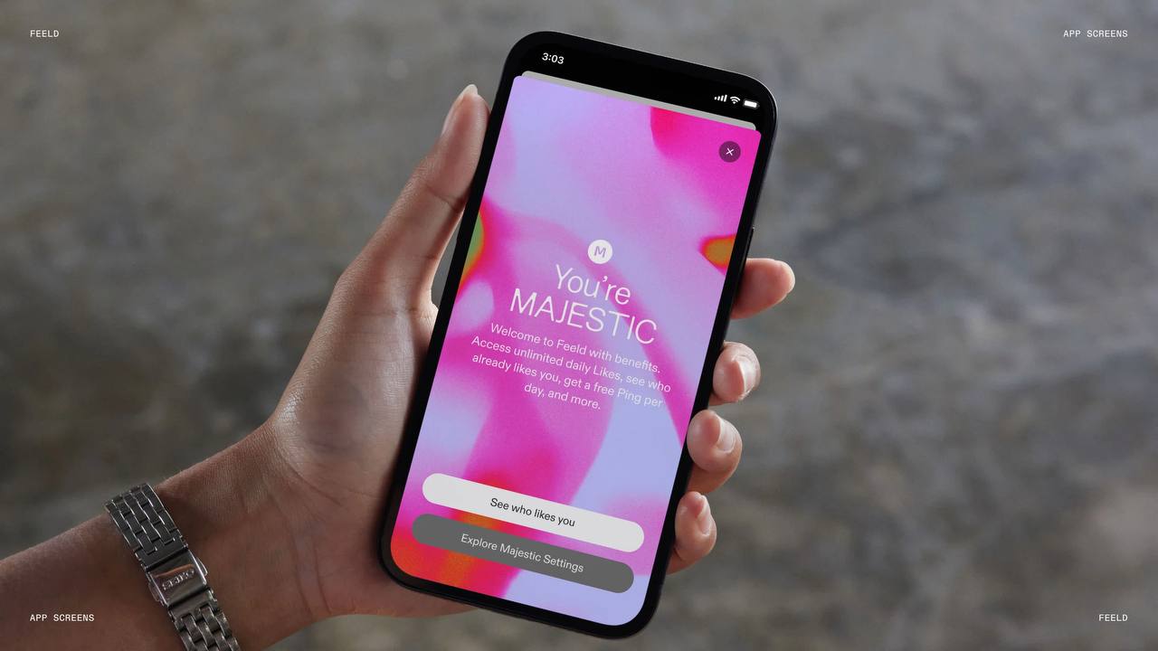
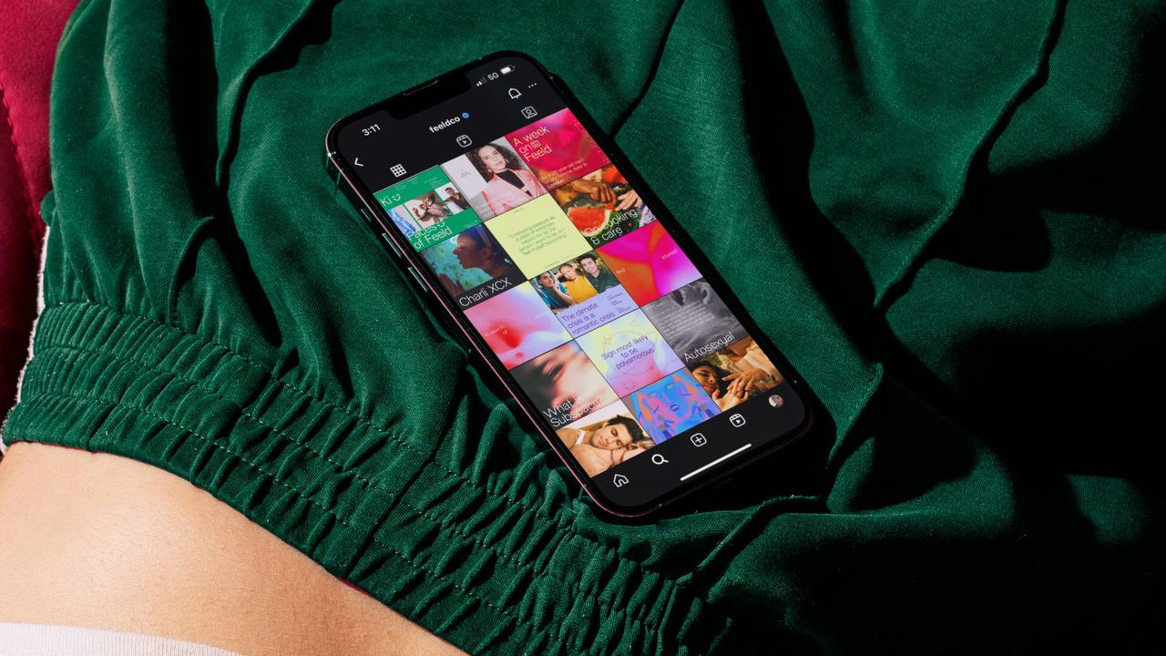
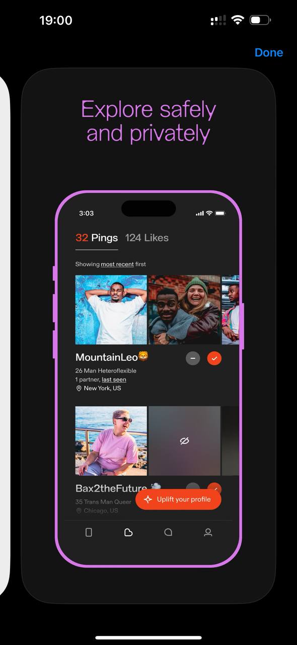
Another redesign! Feeld updated. Also an icon on a black background (yes-yes, it is dark-dark gray, like Batman's suit). New Edge 666 looks sexy! I like the find with the gradient, where associations with a rainbow are, say, third-order. The founder says they need to stop playing tech company and listen to their community. The redesign was made "together." A beautiful narrative for a social service. Let us talk about something else. When they do a rebrand and redesign, they show beautiful shots, campaigns, showreels. And notice: the shot with mobile is not an app screen, it is a profile on Instagram. But that is not the main interaction. All life happens inside the app. 🔎 And there, in the screenshots, I cannot make out sexy typefaces. It does not let me past the strict login form. The team writes they have technical problems. And I thought I had been banned. One of the App Store screenshots shows an ordinary, old UI: strict, with orange-red accents. By the way, it has aged well over 10 years. The animations are beautiful. We admire this. And wait for the loud words redesign and rebranding to stop being a flash in social networks, which you still need to find to feel, and become clearly felt through the main interaction experience ✨