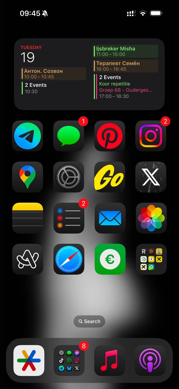
Frequently used apps on home screens benefit from a new image. Picture 1 The set of visual techniques and styles can be anything, if there…
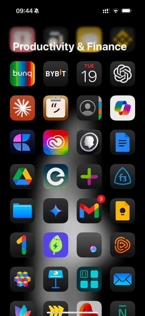
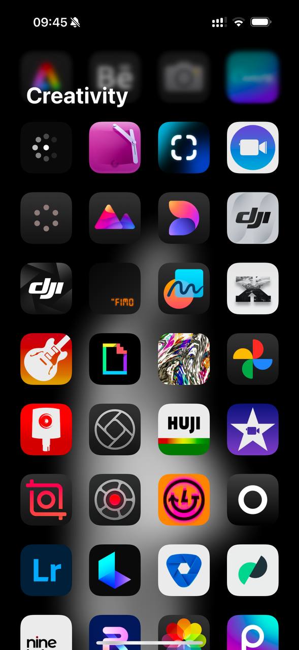
Frequently used apps on home screens benefit from a new image. Picture 1 The set of visual techniques and styles can be anything, if there is a strong connection between the icon and the product behind it. If frequent use has formed (as with Arc for me). Or a clear metaphor (as with Settings). Or the name of the product/service (as with Go) Pictures 2 and 3 An illustration of a visual charade. How many do you know here? If an app was downloaded out of curiosity and did not become frequent, without labels it becomes harder to guess what it is for. It feels like on home screens you want icons without labels. And in the list of all apps, with their names. After all, we search for apps by names 🤔 And add the feature Danya suggested in the comments to the previous post: show names on long tap P.S. Also, intuitively, I want to make the large icons just a bit smaller, to give more air between them 🌬️