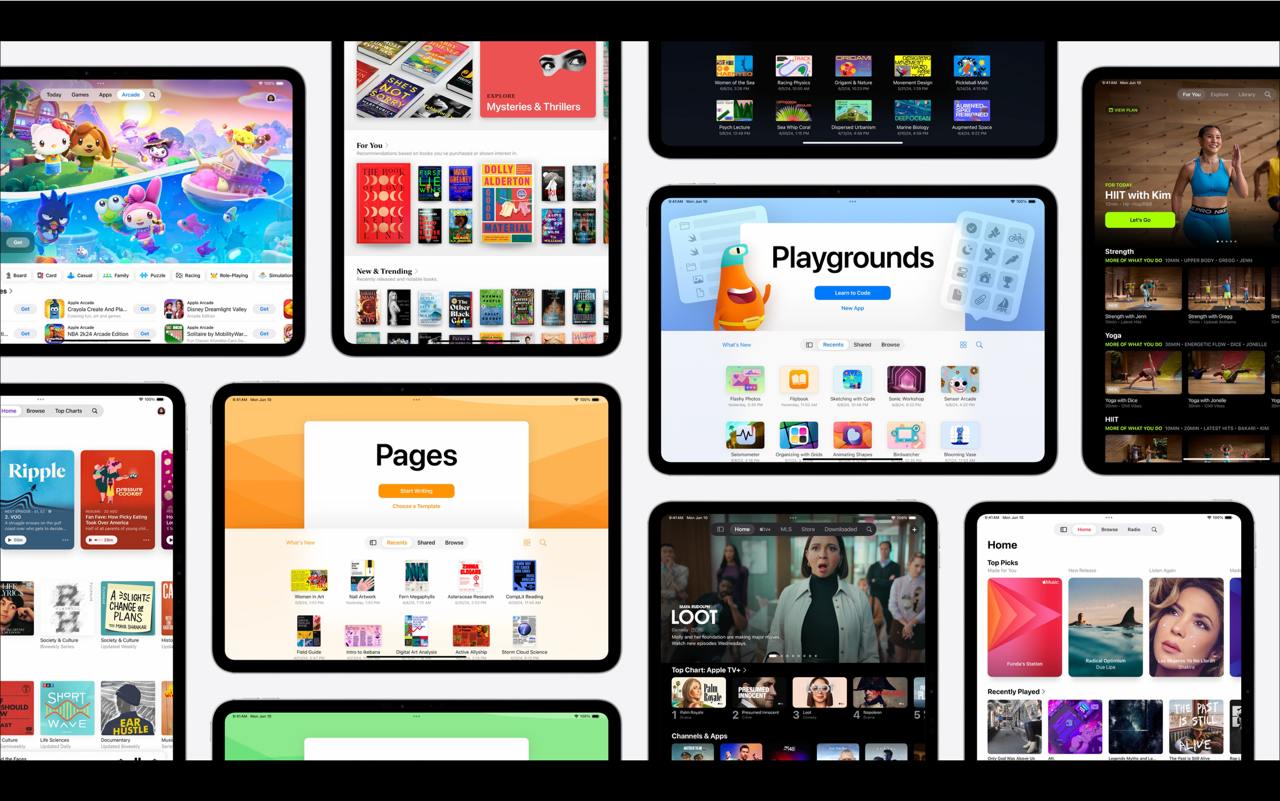
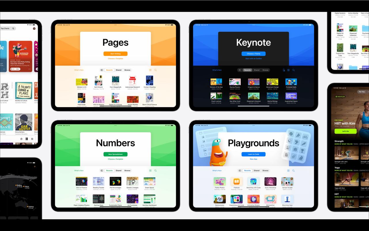
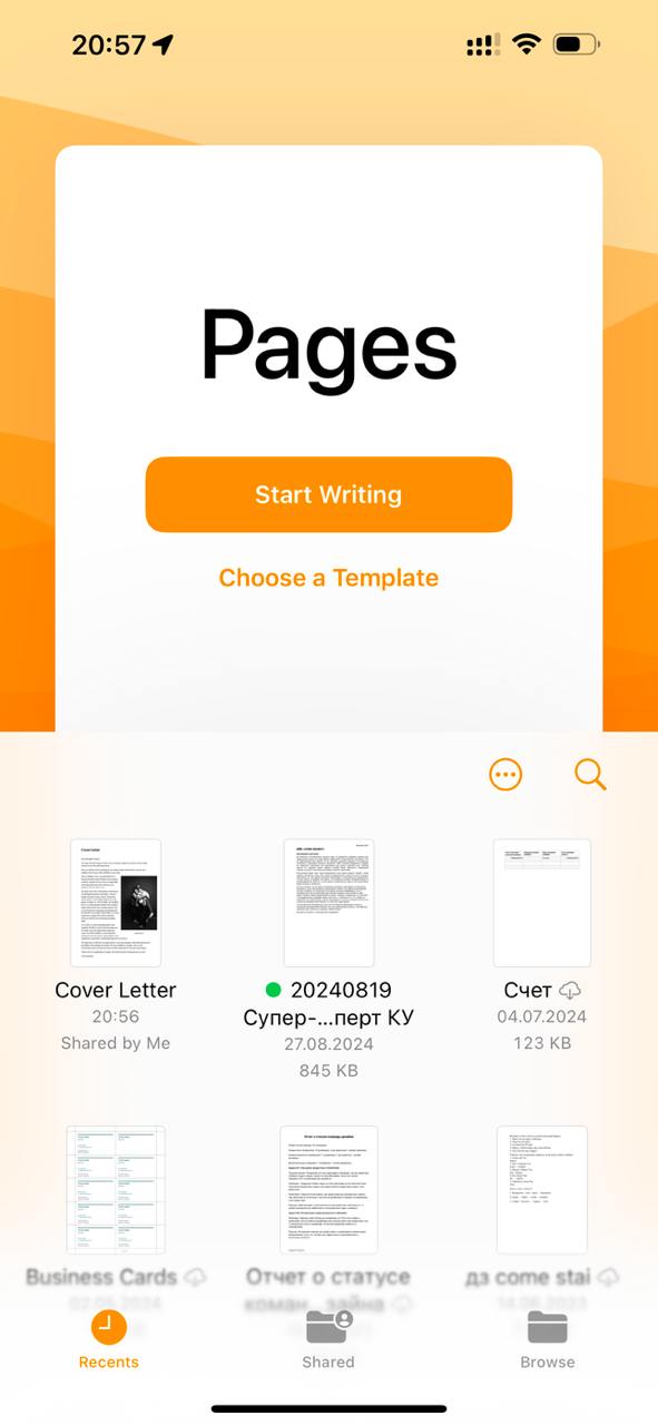
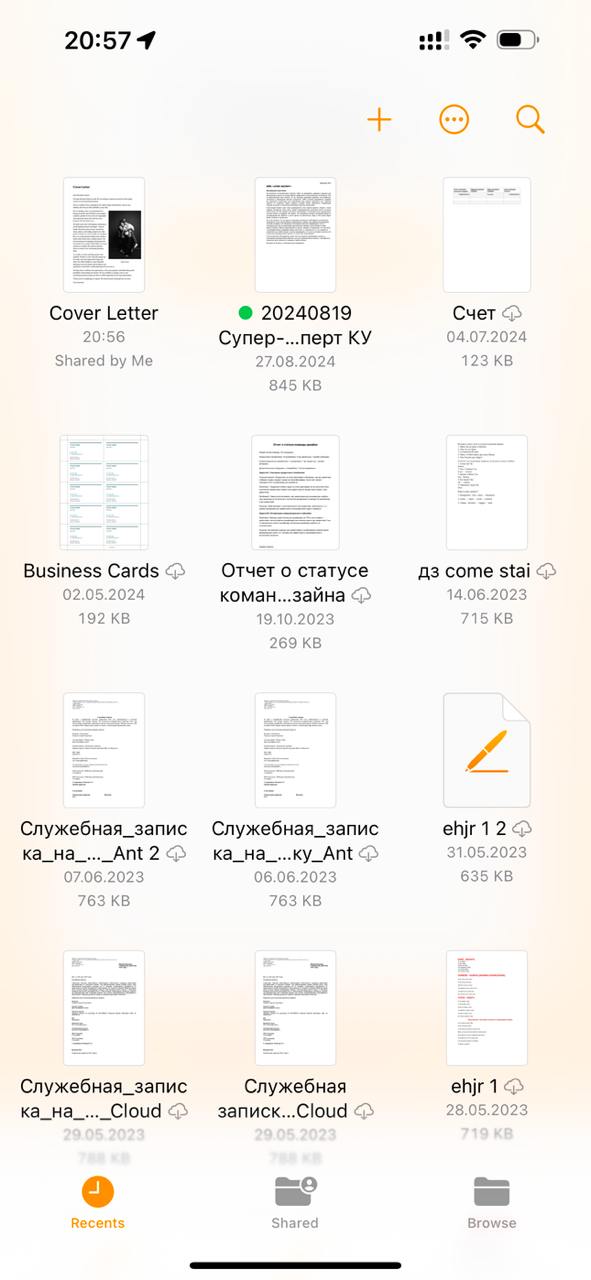
Usefulness, drunkenness, simplicity When I watch presentations, external or internal, I take a ton of screenshots. Here, opening the mobile…
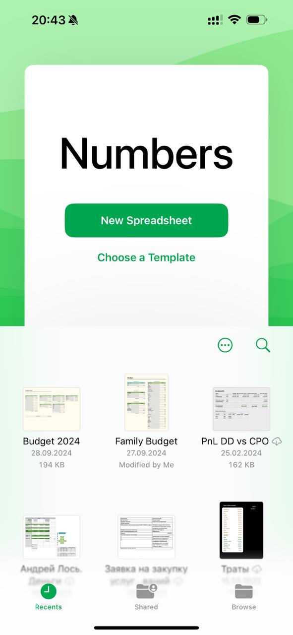
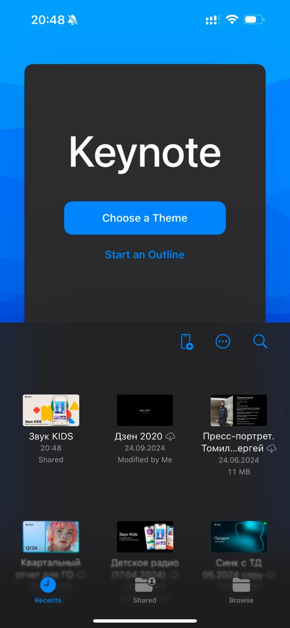
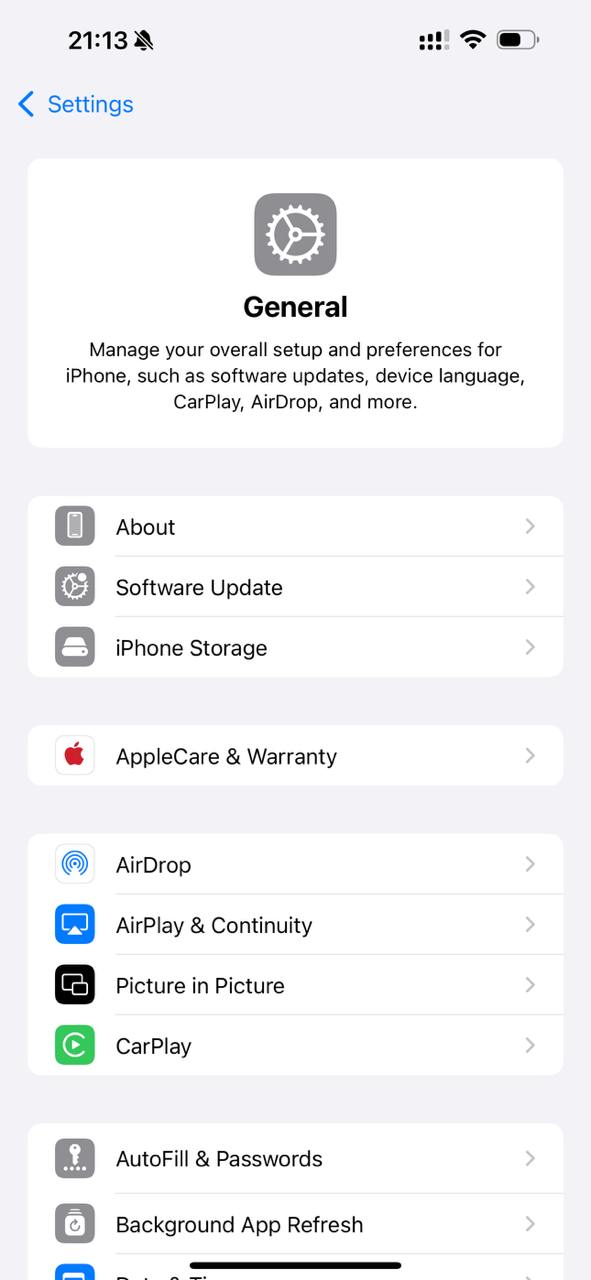
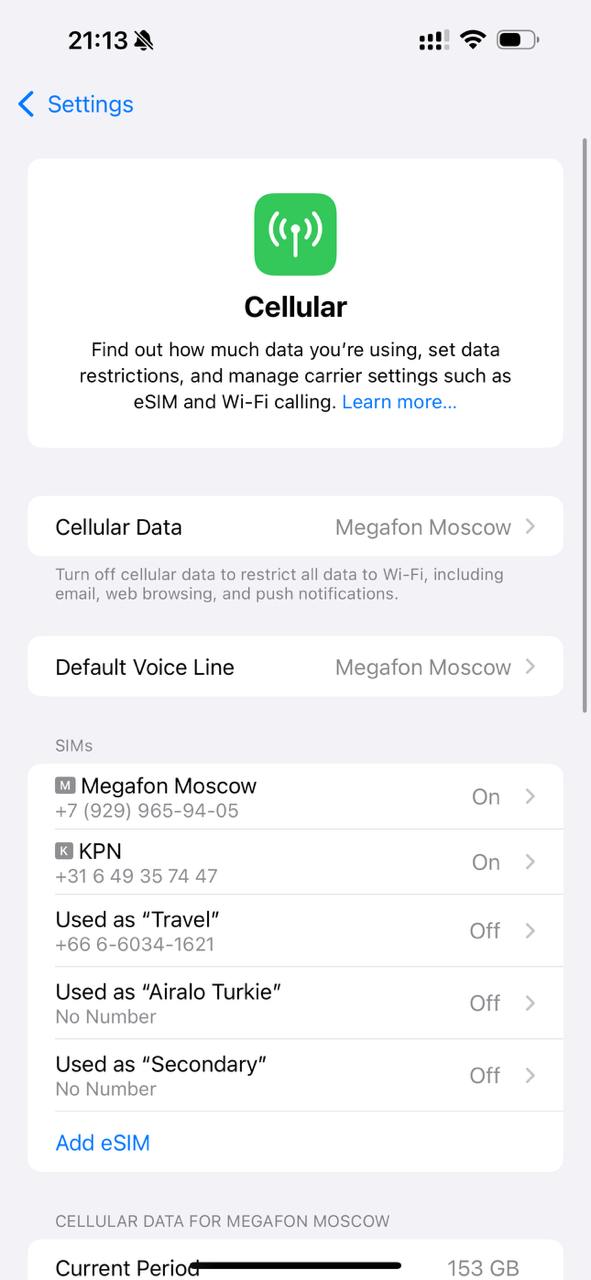
Usefulness, drunkenness, simplicity When I watch presentations, external or internal, I take a ton of screenshots. Here, opening the mobile version of Pages, I noticed a pleasant, emotional start screen. I checked it against the pictures shown at WWDC - the design matches production. Amazing consistency. I wanted to write: "Keynote, go to bed, you are drunk." But it already came to the presentation this blue. Could they have not made such start screens? They could have. Would it have been sexy? With this decorative design, the start screen promises simplicity of interaction. Compare two pictures (No. 5 and No. 6): in the right corner of the ring, "Feeling of lightness and simplicity" vs "Hopeless paper work" in the left corner. Who are we betting on? At the same time, the sexy screen turns into a full list with one cheap swipe. Mobile phone screens are stretching taller. You do not need to stuff them from top to bottom with "useful" content. That will overload perception and backfire. Pay attention to the feeling from perceiving the screen. Look for balance, proportions, and dosage of the information being served. Screen design is like mixing a cocktail. The designer is a bartender. The impression of the whole product depends on his decisions. By the way, designers from other teams are also guided by principles of information dosage. For example, the settings screens in iOS 18