Apple Music launched a project with a telling name. You can see it here: 100best.music.apple.com No subscription is needed; for acquaintanc…
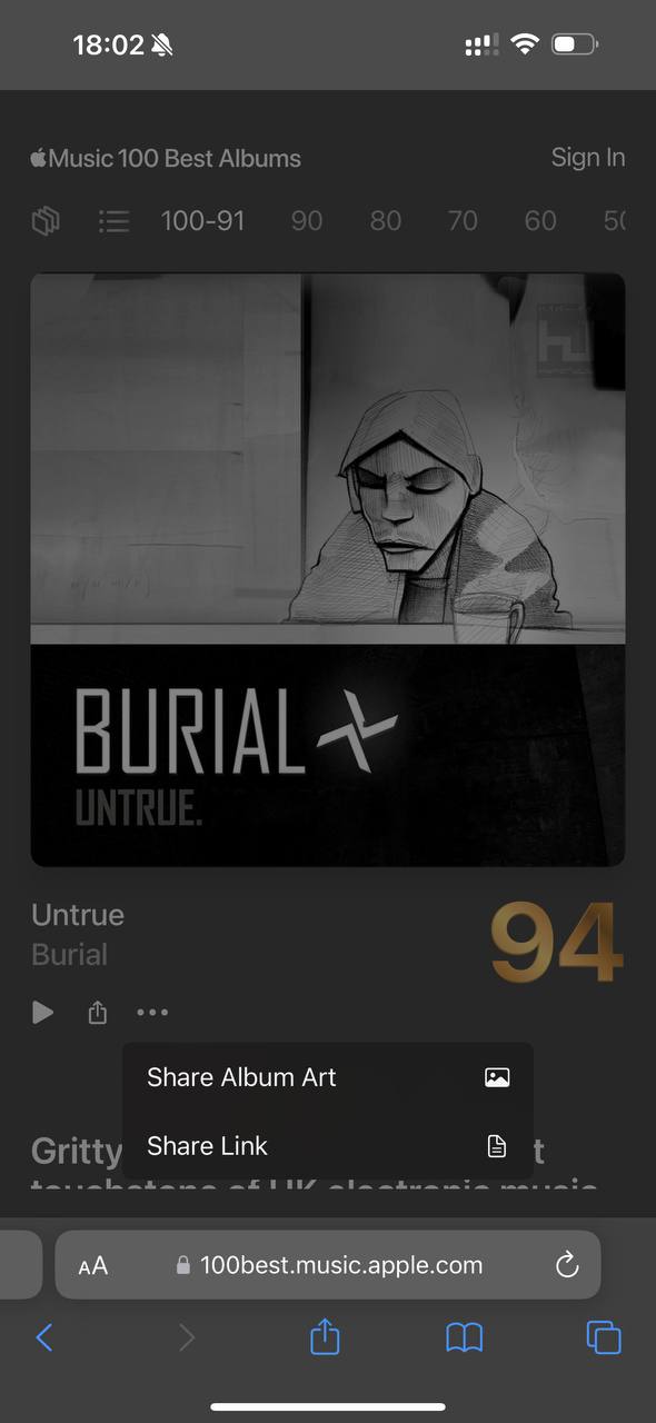
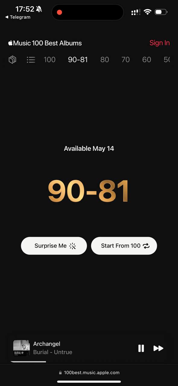
Apple Music launched a project with a telling name. You can see it here: 100best.music.apple.com No subscription is needed; for acquaintance, each track from an album plays for a minute and a half. Seems like good timing to form an impression. 1. I like how smoothly the landing page turns into a Cover Flow album discovery interface 2. The discovery interface itself is funny. They let us feel the music medium. What is this, vinyl packaging or a CD? 3. The site supports light and dark themes, color tokens and dependencies. Look at the player; depending on the background, it changes color. 4. You can share not only material, but also just the cover! I have long dreamed of such a feature. To get high-quality artworks immediately, instead of searching separately. 5. Cover Flow mode is wildly slow in Chrome 😭. That is, a project for attracting a new audience can crash on the reefs of low performance. 6. Cool filler on categories that have not yet been posted. Why would a company do this? I think to attract a new audience. That is why it is a separate site, not embedded inside the app. Attraction through immersion in music. Good editorial work. As Seryozha Korol says: "the more we know about music, the richer it sounds." A solid project. I like it By the way, why does Apple Music love Usher so much?