We talked about the pepyaka, now it remains to talk about stretching agents. You have noticed, yes, that icons deform at the moment of open…
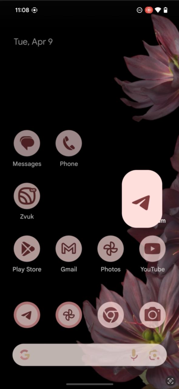
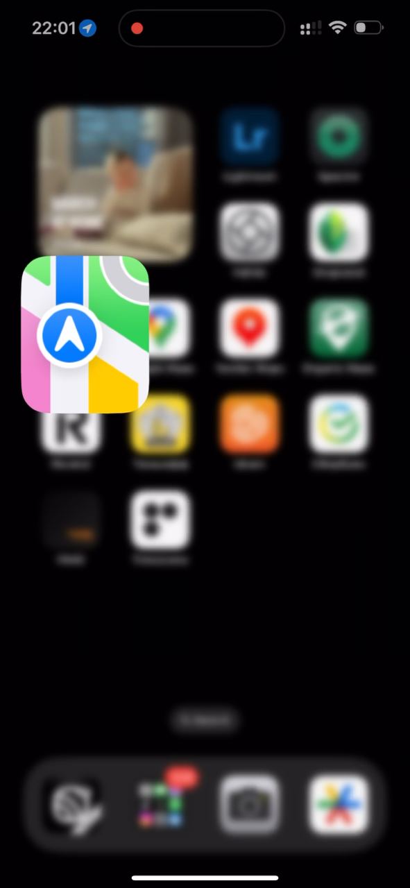
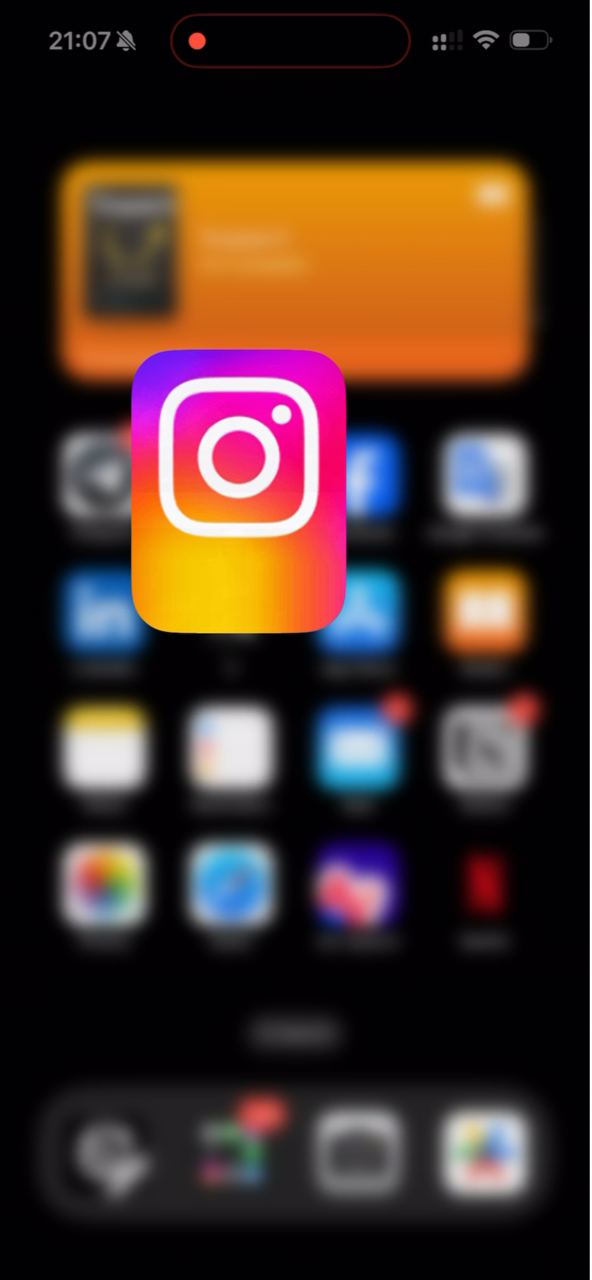
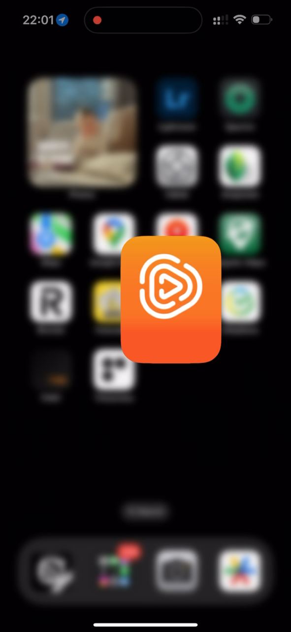
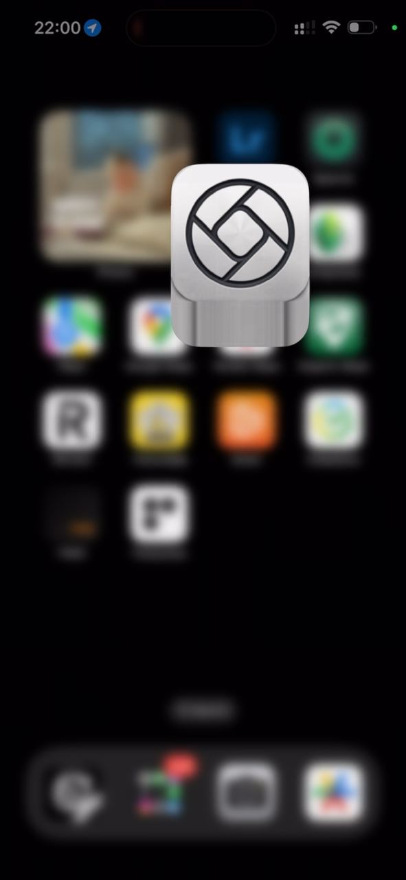
We talked about the pepyaka, now it remains to talk about stretching agents. You have noticed, yes, that icons deform at the moment of opening and closing apps. On Android, the area deforms in all directions, while on iOS only downward. Why so? In recent Android versions, home-screen icons are adaptive. They have two assets: the object and the background. This way they simplified developers' lives for different launchers. The background can take any shape: a circle, as on Pixel; a squircle, as on Samsung, and so on. Previously there was such a headache: icons of different shapes and with different cast shadows could stand next to each other. And launchers tried to solve the problem on their side On iOS, during transformation, only the lower part stretches. Why did they not do it like Android? I think iOS monolithic icons are living through their last releases. Almost always, stretching the edge pixels goes smoothly. Only icons that do not leave a safe zone at the bottom get unpleasant artifacts. Nevertheless, this is an elegant design solution. When only the lower part transforms, cringe states appear less often