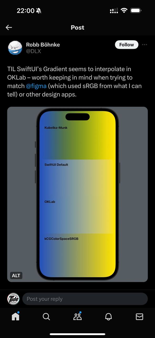
Let us be honest, sometimes you want a simple human gradient pleasant to the eye. Without kinks, drops, and sliding into the grayness of ev…
Let us be honest, sometimes you want a simple human gradient pleasant to the eye. Without kinks, drops, and sliding into the grayness of everyday life without drugs. You look at an Apple app and it seems you drew it the same way, but still it is not the same. And their teams do not pray to Figma. They use different available and unavailable tools to get the maximum-quality result. There are internal tools for designers where they tweak interface parameters in a native environment. You can start thinking about clean colors from here. Evil Martians have a good guide, and they also made a color picker. In two words, what is wrong with default gradients: different hues have different amounts of color. RGB space does not reflect this difference. The screenshot is from this tweet