The main hero of the update is the built-in Podcasts app. The app stopped being the younger one and wearing hand-me-downs from Music's past…
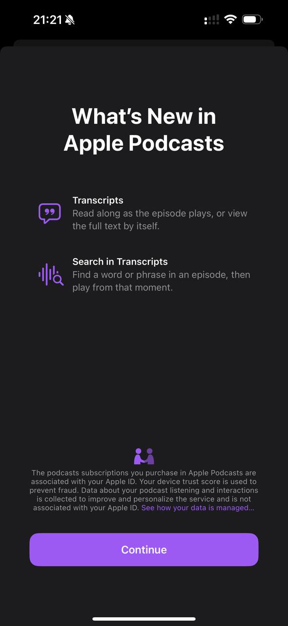
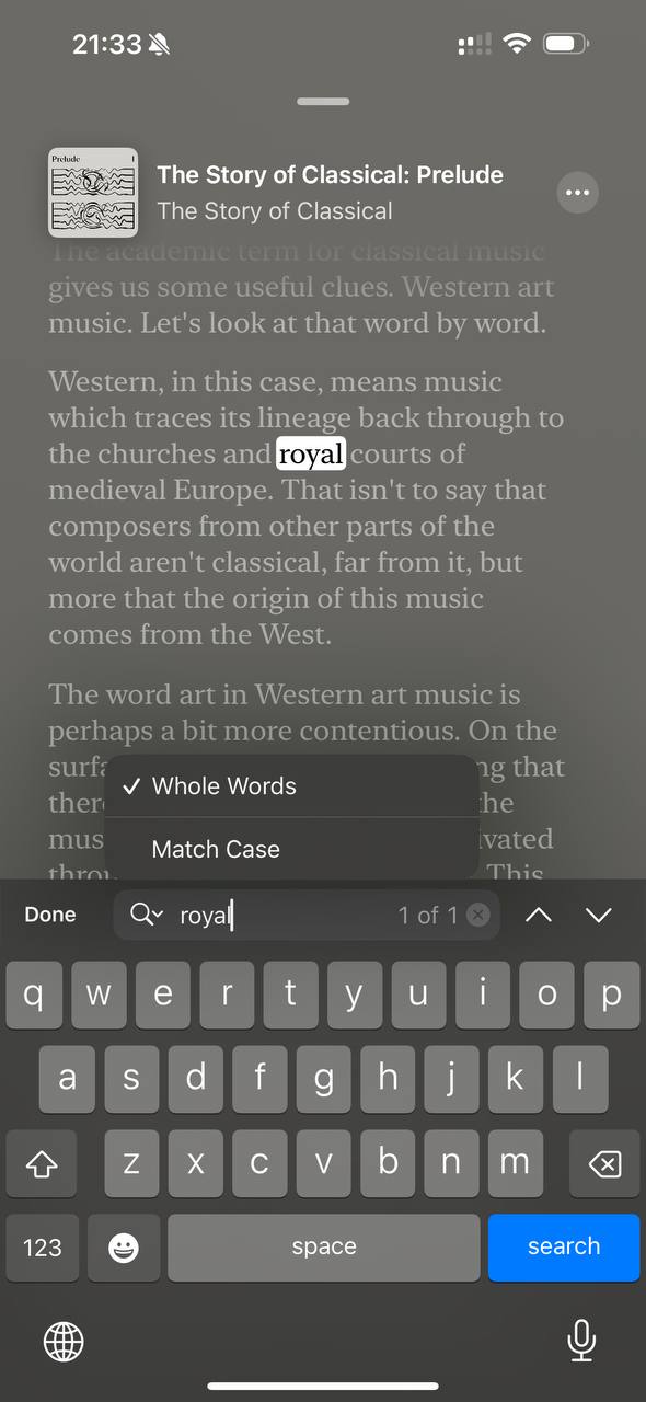
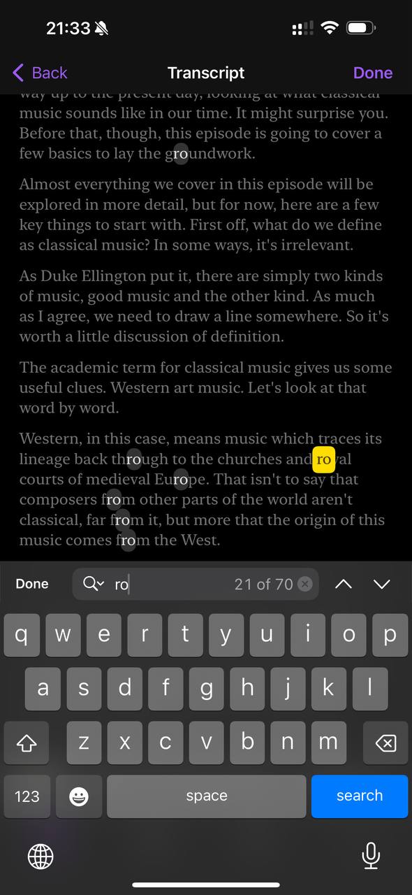
The main hero of the update is the built-in Podcasts app. The app stopped being the younger one and wearing hand-me-downs from Music's past seasons. Now the parents buy new clothes for both. Probably under the hood there is a story we will not be told about how the teams stitched together their values, components, and codebase. I recorded a small demo. And separate accents. A block with a transcript of the conversation appeared on the podcast episode page. There is a footnote saying the transcript was made automatically. How was the transcript embedded into the app? Exactly the same way as in Music! Elegant. I attach a demo so you do not have to run and check. In the player there is the same "show text" button. The same three dots on playbacks, and exactly the same animation of transforming the "large cover" - "text" modes as in sister Music. In text viewing mode, attention focuses on the floating Search button. On one hand, a rare solution in the iOS universe. On the other, search is in the same place as on the home screen. In the search field itself, an appendix appeared that changes the search mode. Visually it looks dull - a downward arrow sewn onto a magnifying glass. Curiously, a different mode is used for selecting text. When the option is activated, the app throws you into another view. My hypothesis: they could not implement text work in the current layout approach. It was not built into Music. Maybe selection work broke the smoothness of interaction. These soft, smooth animations are a blast. Unfortunately, podcasts in Russian do not yet have a transcript block. Screenshot in the comment - it did not fit into the post. Accordingly, there are no menu items and the button in the player is disabled. Maybe someday. We can only wait and believe I showed my favorite podcast in the comments. Share yours ✨