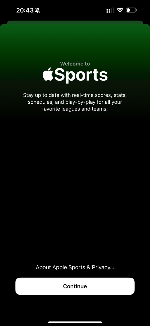
Recently Apple released a separate Sports app It is not sewn into the operating system, like Journal, but is distributed separately. Is App…
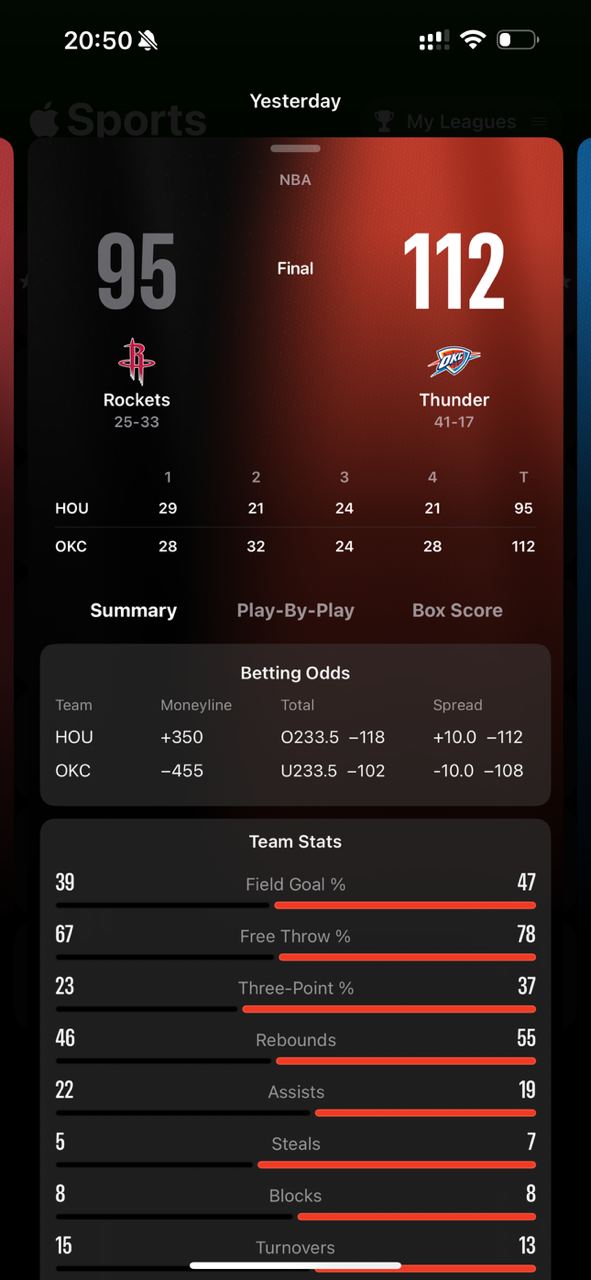
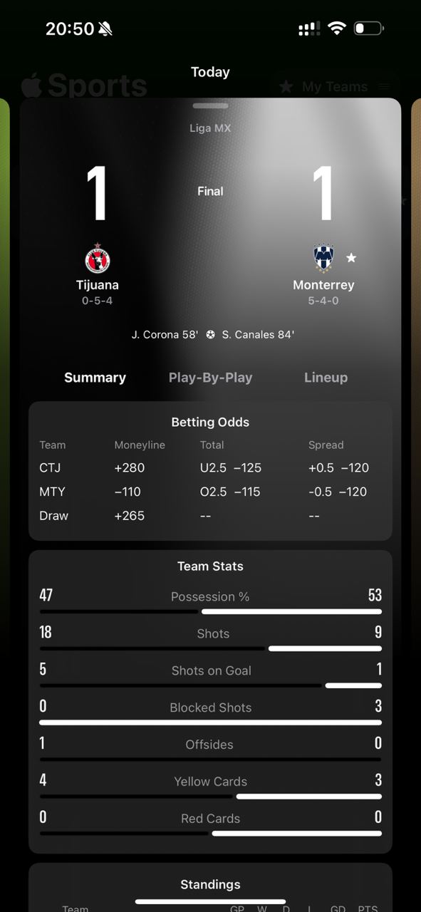
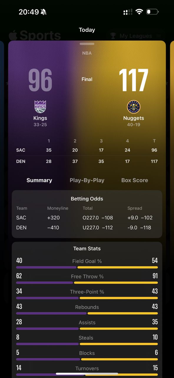
Recently Apple released a separate Sports app It is not sewn into the operating system, like Journal, but is distributed separately. Is Apple moving away from the canon and experimenting? In this regard Android is arranged more conveniently; fixes there are sent as separate APKs, but the other side of the coin: it is harder to convince users to update the OS if you hid something there and now want to fix it 🫥 BTW. It is curious to see how corporate designers handle their visual code. Maybe here we can peek into the future? Rumors say iOS 18 will give fresh topics for discussion. - The abundance of colors and the background animation catch the eye. Gradients are the new black. - Interesting work with information density. Stacks, tables, dynamic heavily compressed font. - The pattern of expanding content entities is the same as in Books. First a panel, which during scroll-dive transforms to full screen. I love this technique! - Working with the list is called not Edit, but Manage. Gives a different attitude to content. Instead of checkboxes - favorite stars. And pay attention to a couple of details: 1. The header. It behaves differently. The title smoothly decreases on scroll 2. Tabs under the header - this was not in the design system! No outlines, only text vibrancy. Where is Tim Cook looking? And the last thing I noticed. Black and white are colors too. On equal footing with others, they can become a team's accent color and be used for coloring progress bars