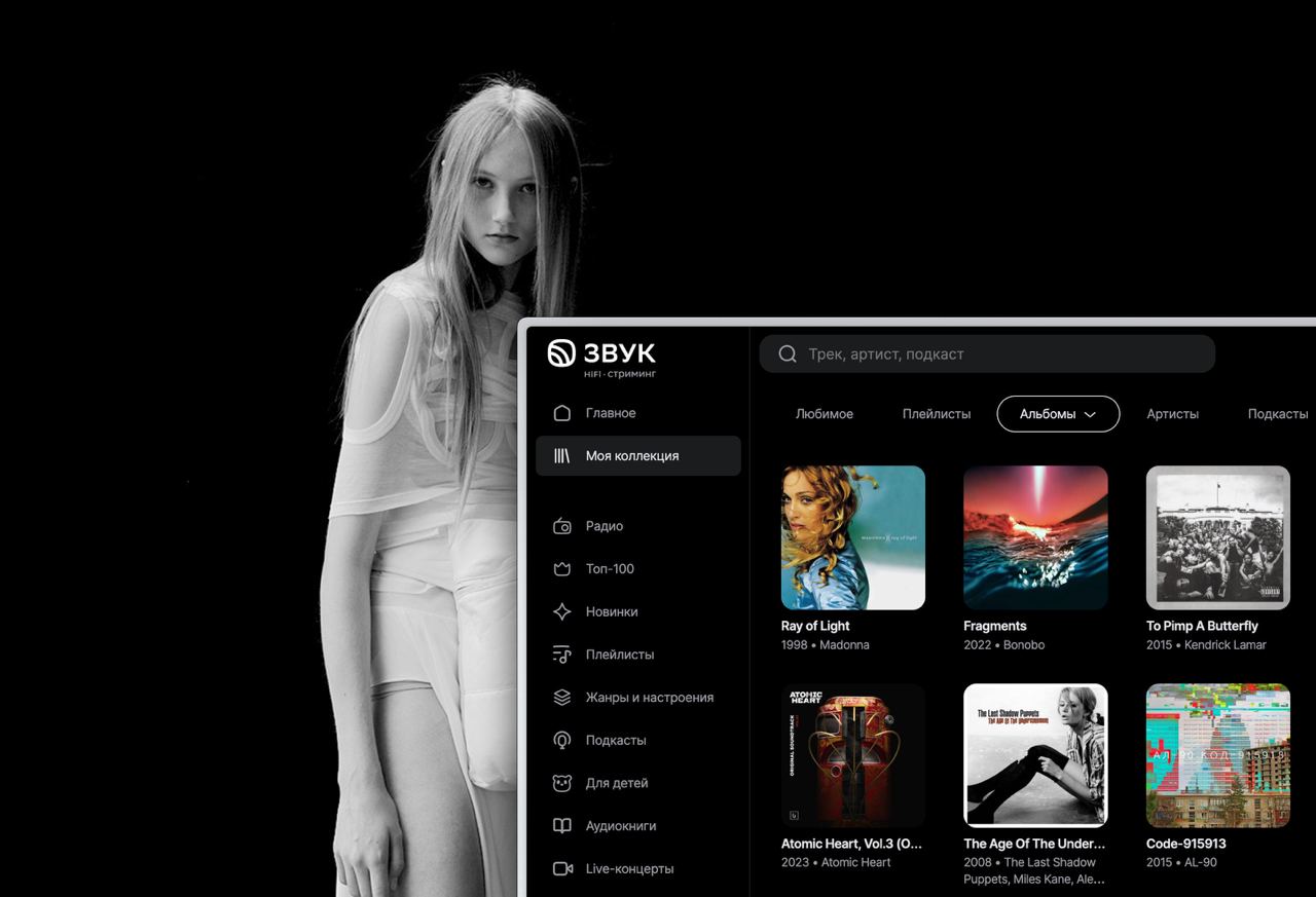
At Zvuk we updated the icon. Is this already a rebrand or not yet, is it time to write an article on vc? Pictures before/after and the logo…
At Zvuk we updated the icon. Is this already a rebrand or not yet, is it time to write an article on vc? Pictures before/after and the logo. Why is this needed? Work on communication was like a rebus. If we are talking about the brand, then we put the logo. And if we are talking about the app, then the app icon, so there are consistent signals along the user path. And is the logo icon + text? No. The logo has the full sign, while the app icon is like an enlarged sign, the waves spread out there, and the cookie shape itself is the frame... Are you still here? The better people understand each other, the more meaning they will convey to clients. The clearer the signal, the more effective it is. From now on: the app icon is the logo. Praise the Sun!