There are different mental models for checking interface quality on your own. My two favorites: 1. The person is always in a hurry. 2. The…
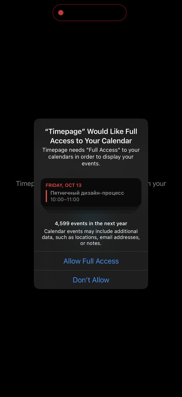
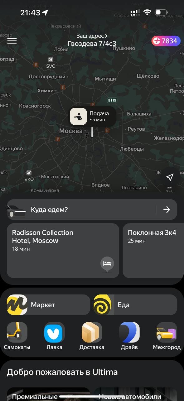
There are different mental models for checking interface quality on your own. My two favorites: 1. The person is always in a hurry. 2. The person is always drunk. You can take them as axioms. Recommended! I like thinking of them as one general model. Look at the result of an interface designer's work through the eyes of a drunk person in a hurry. The drunk user is clear enough: Drunk, not dumb. Large buttons, unambiguous wording, easy-to-interpret flows, linear scenarios. In general, this is exactly the kind of product we try to make! For example, Taxi. A good app suggests the destination, the tariff is already selected, the buttons are large. Perfect for tipsy Sergey stuck at a bar. The principle "The person is always in a hurry" is subtler and slips out of focus. A cognitive distortion among people who work on products and interfaces: it is customary to think that a person is interested in figuring out the app. Sergey sprawls out on the couch, puts on his glasses, carefully goes through onboarding, reads popups and stories, makes notes in a notebook. Of course not! Sergey is holding a backpack with one hand, listening to a call with one ear, calling the elevator with the phone in his other hand, launching the app at the same time, there is no connection in the elevator, your stories do not load, and he needs to get the thing done and return to the call. Onboardings and popups are obstacles on the path. The person is in a hurry. They launch the app at the last moment, in a moment of urgent need. Popups should disappear. If a feature is important, the main interface should modify itself, transform so it can display this "useful" information. Yes, this takes work. You see such interfaces in games, but in ordinary apps almost nobody thinks about contextual informing. It is curious to watch the evolution of popups here. They will arrive at contextual implementation once someone sets the trend and designs an interface that transforms on request from the server. For now we see how the calendar popup has learned to show a "native" current little calendar — wow! And here is another popup example with useful instant actions sewn in: sharing through AirDrop! And the link: The User is Drunk