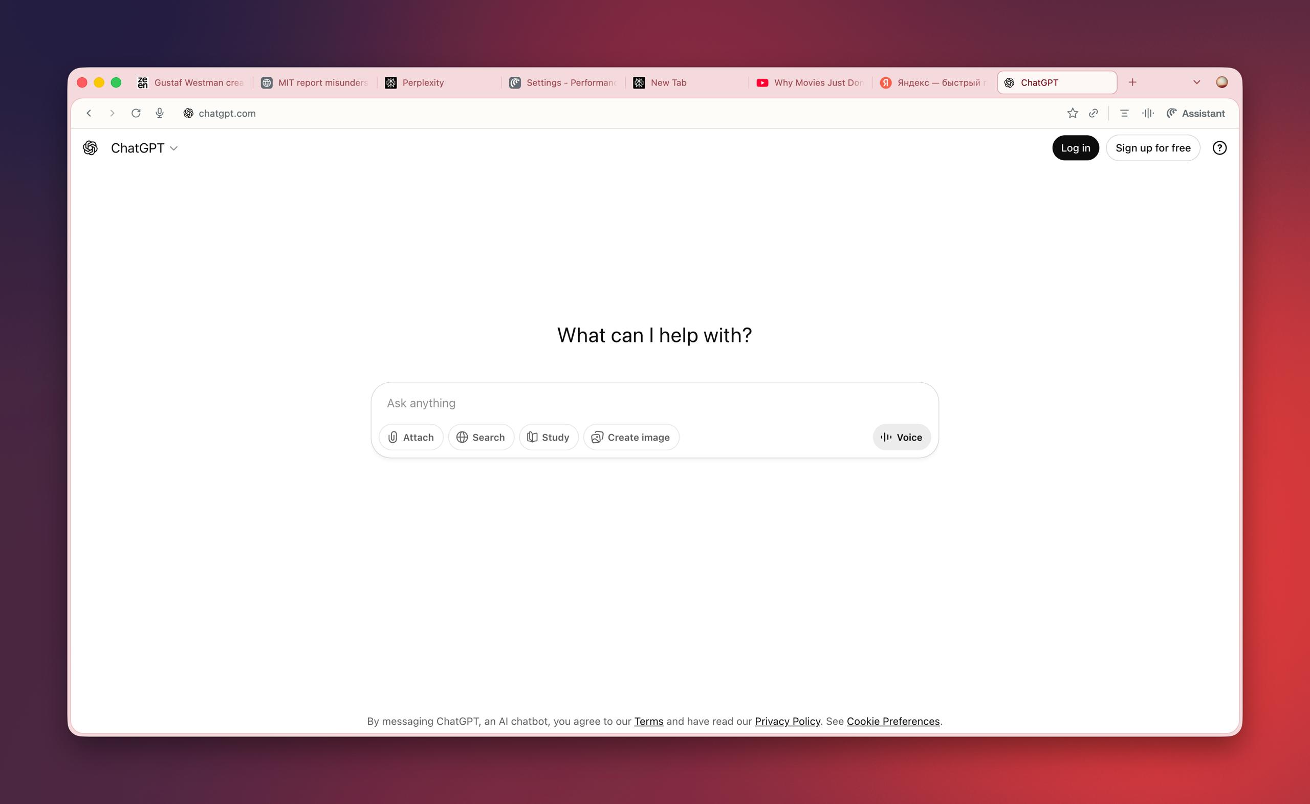
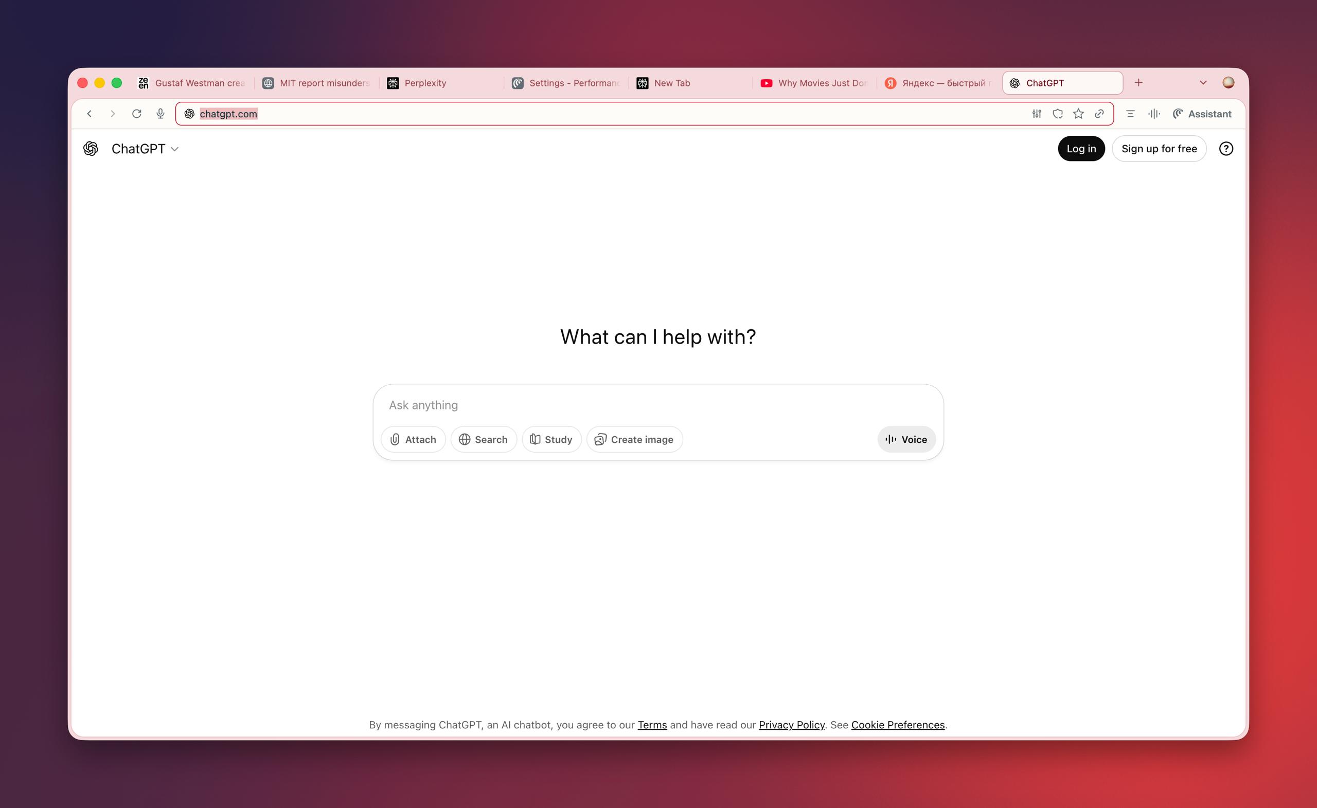
Chrome - tabs are of a sufficient size, for which thanks. There are fewer shades of gray. They got rid of the abundance of shadows on small…
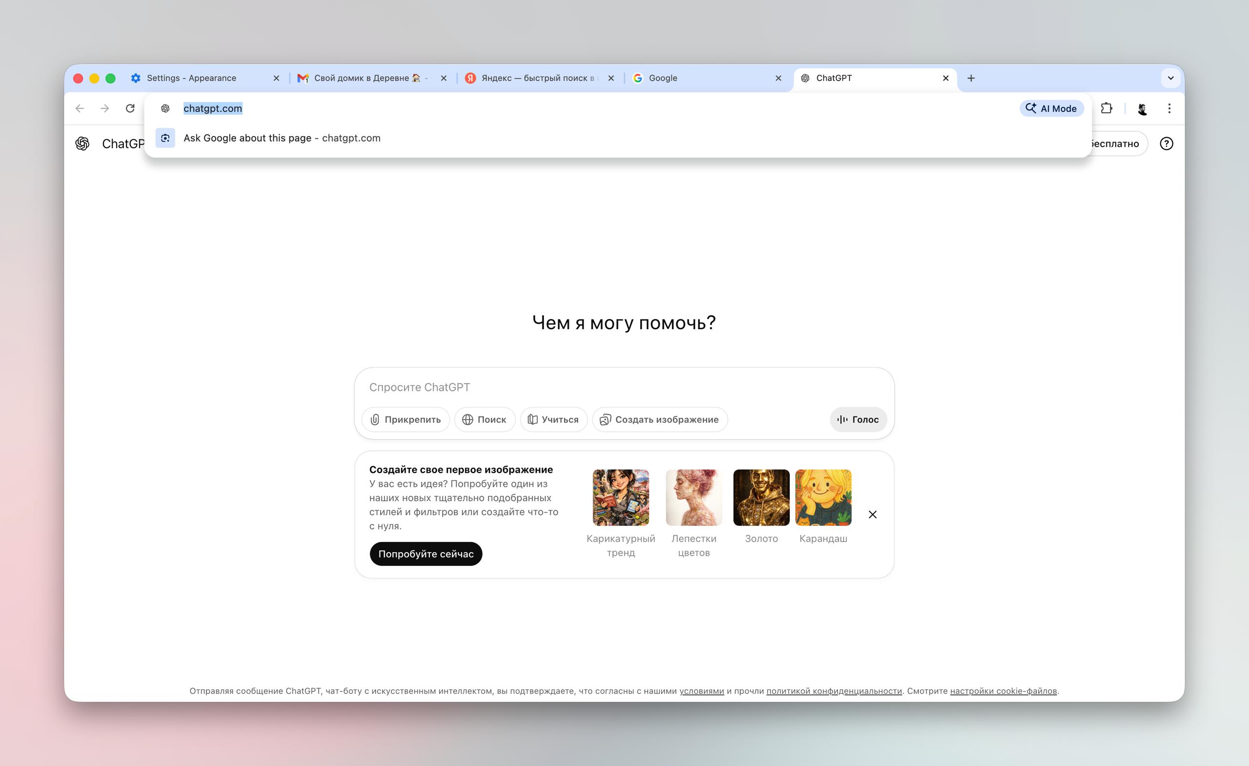
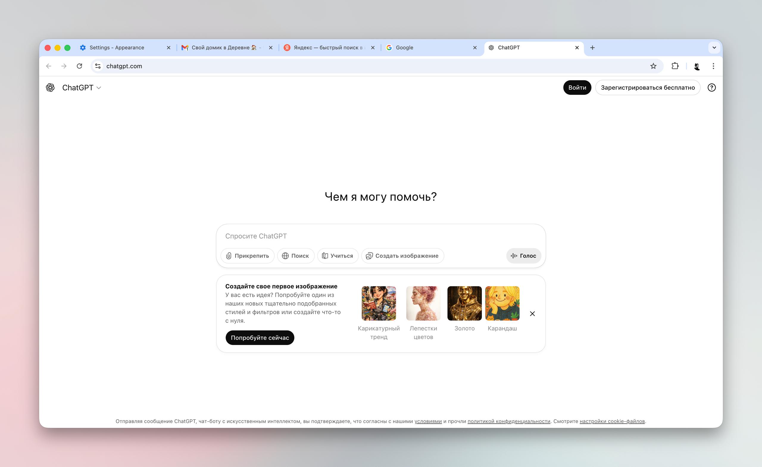
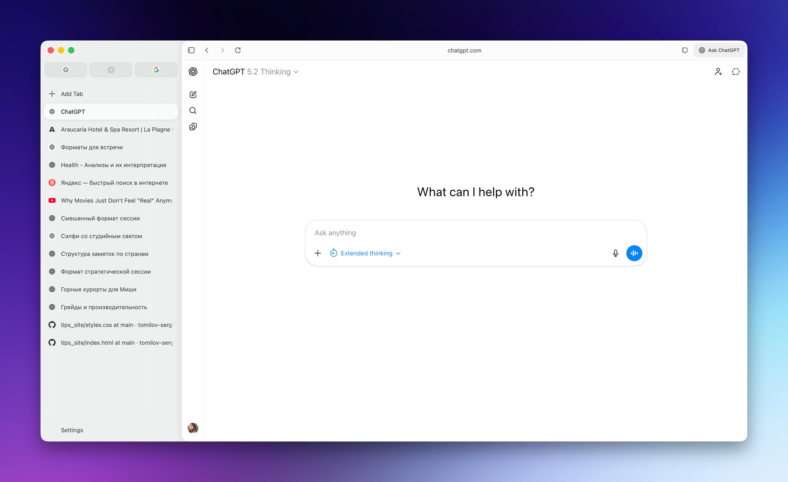
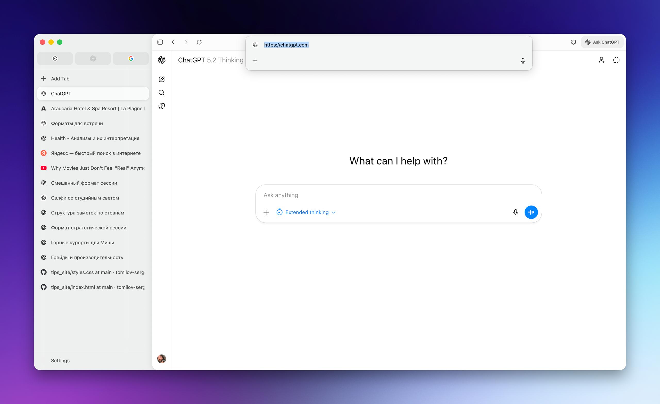
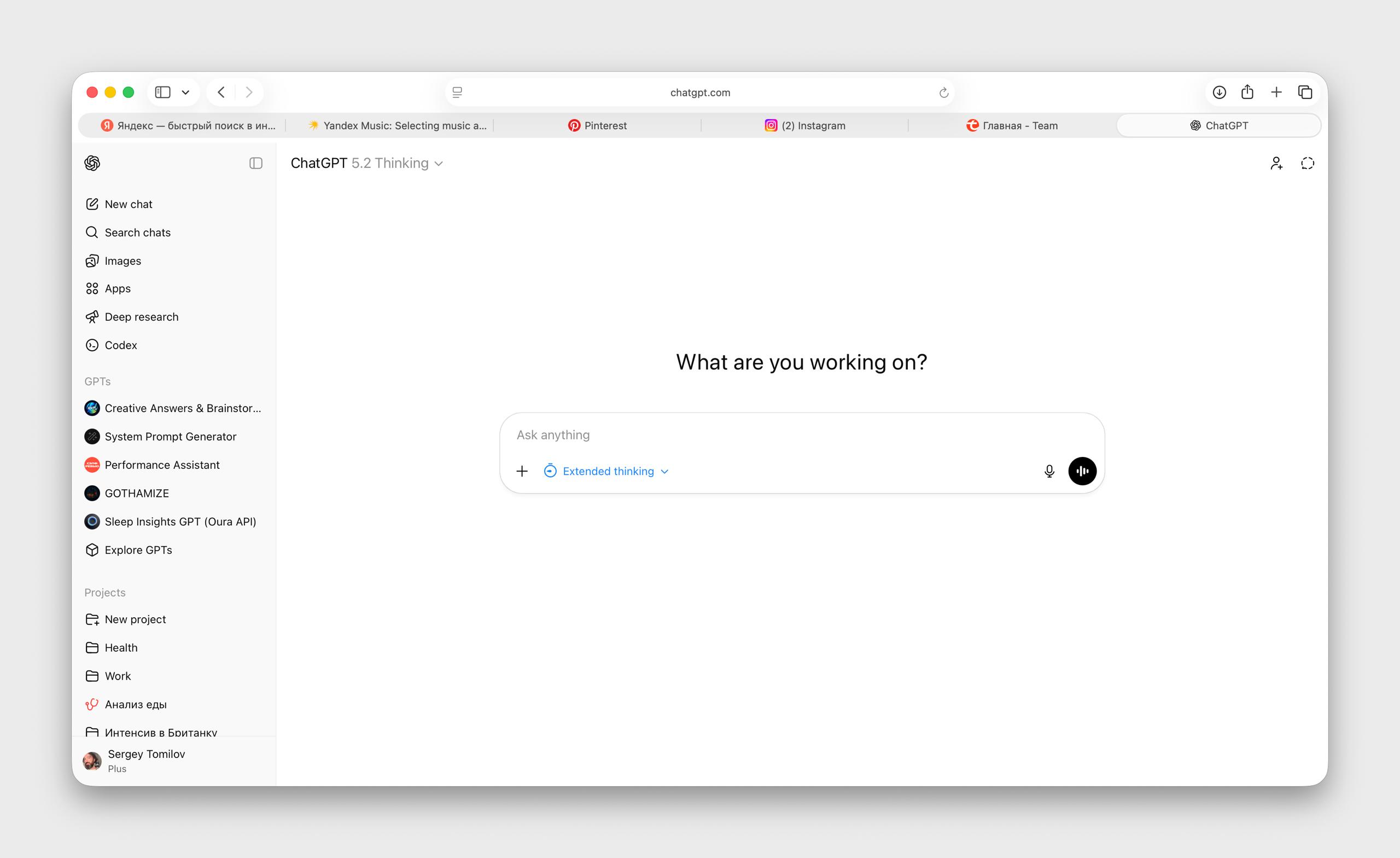
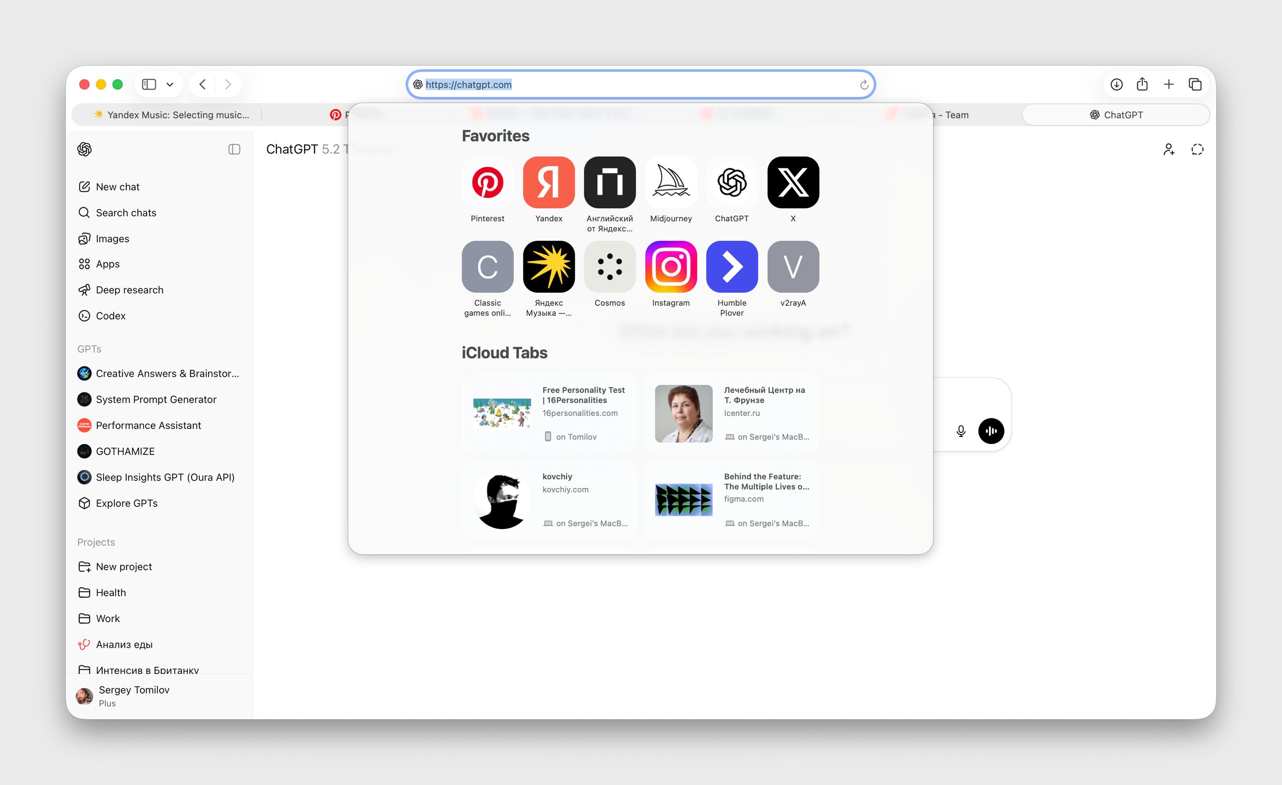
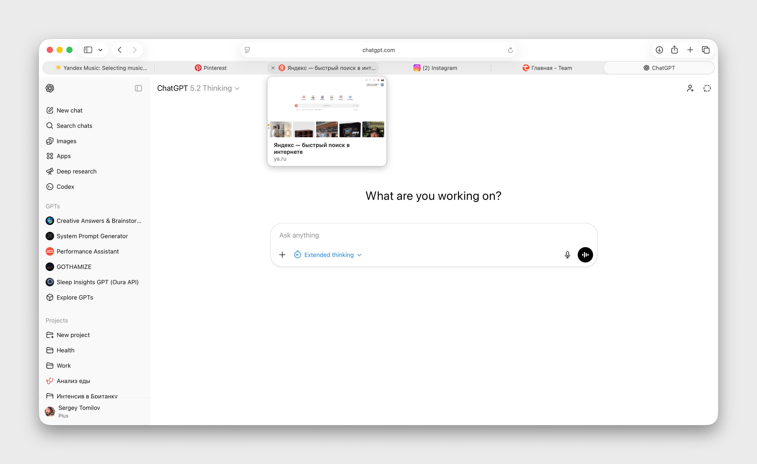
Chrome - tabs are of a sufficient size, for which thanks. There are fewer shades of gray. They got rid of the abundance of shadows on small elements. It became cleaner and tidier ChatGPT Atlas - in my humble opinion, today it has the most beautiful interface. In terms of cleanliness, visual elegance, and working with shades of gray for element contrast Comet from Perplexity - a little excessively graphic. There is its own charm in this, but the charm fades because of the small elements. I want more air. And consistency with the main product. Right now the browser is visually detached from the main product Safari - the formula for the perfect browser has left the team. The elements are large, but the game with elements hanging in the air played a cruel joke: you have to look closely, the controls lack contrast. Instead of true lightness, the opposite came out. Minus vibe Screenshots 1 and 2 - Chrome Screenshots 3 and 4 - ChatGPT Atlas Screenshots 5 and 6 - Comet Screenshots 7, 8, 9 - Safari