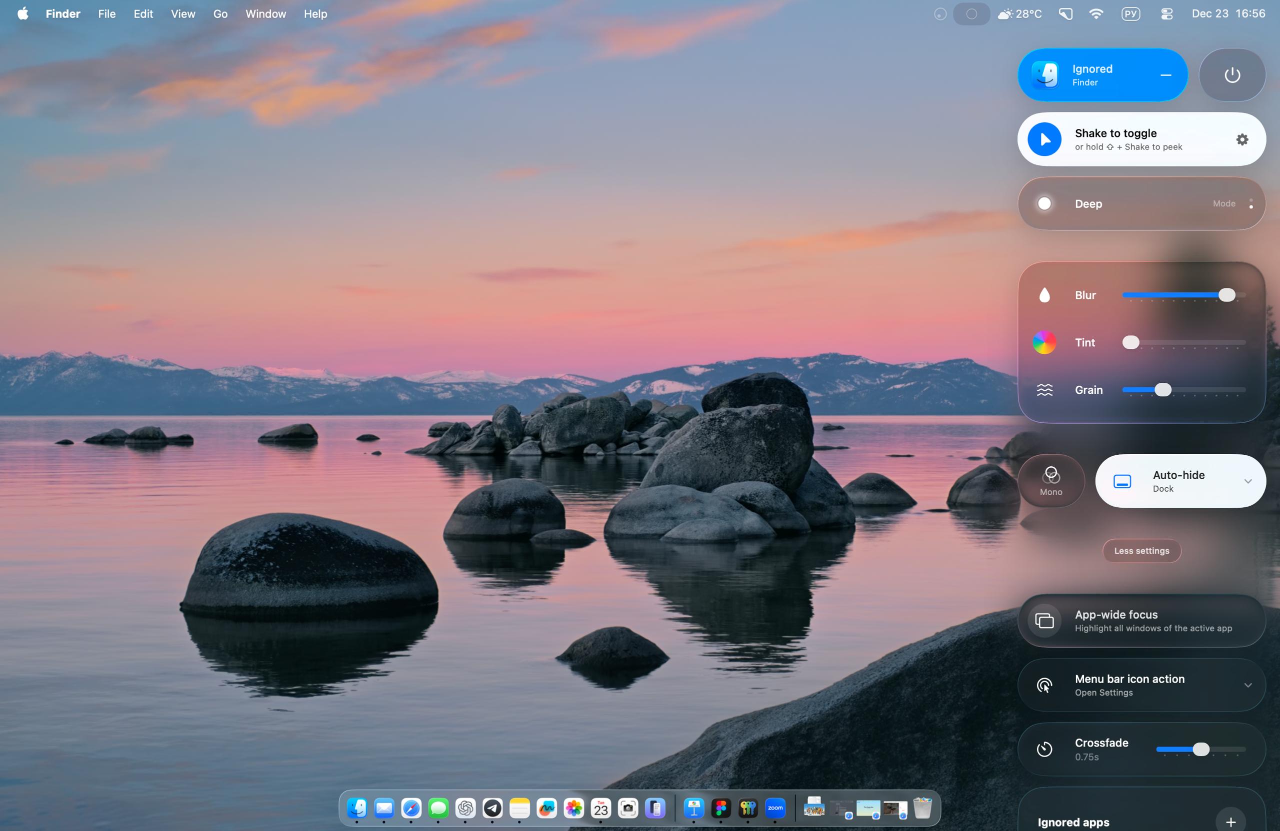
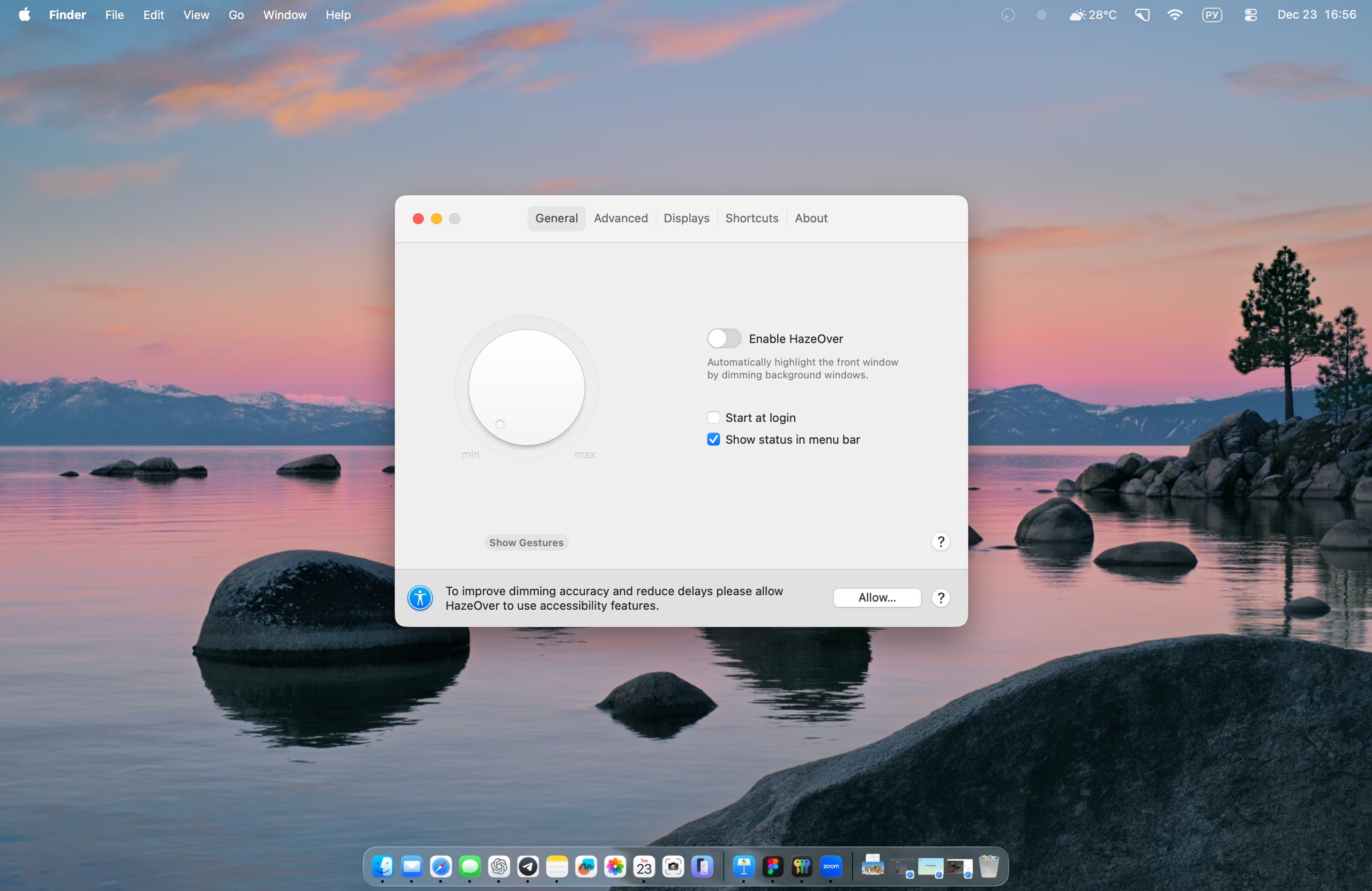
For a long time I used HazeOver - an app that darkens interface elements behind the active window. The stronger it highlights it. In interf…
For a long time I used HazeOver - an app that darkens interface elements behind the active window. The stronger it highlights it. In interface design, a similar technique is often used so pop-up windows and offers look more contrasty (is this already dark patterns or not yet?) Since the first time I enabled HazeOver, I dreamed that an update would come out where instead of dimming there would be blur. I waited. But! In another app Monocle Creates a beautiful blur of the screen behind the active window. Looks super-sexy. The third version is out. There is full blur and progressive-blur. A kind of compromise: "let's blur it, but just a little". As if the app was not created by an enthusiast, but by some corporation, with seven meetings and eight calls (let's choose the blur color, colleagues) A special pleasure is how the app creator reimagined settings