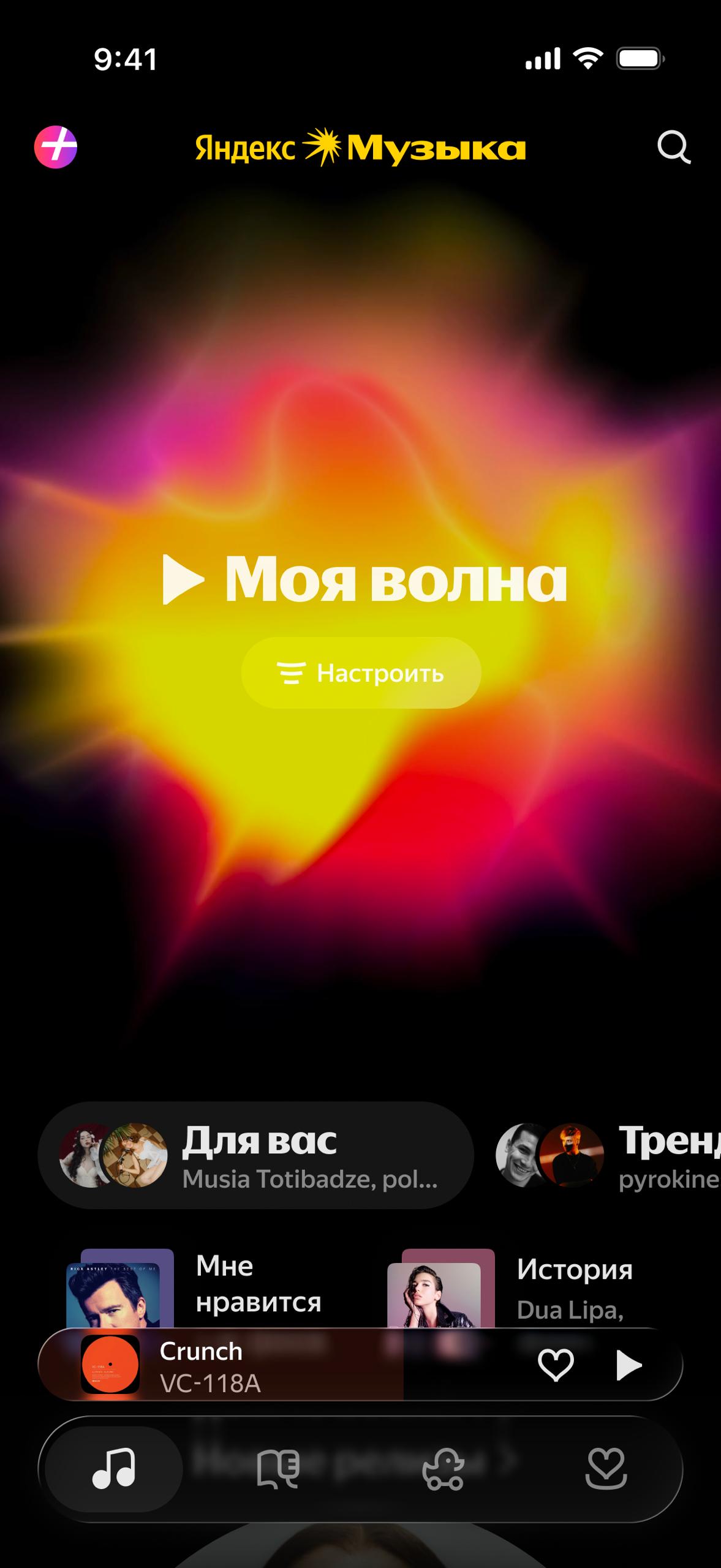
The day began with a message: Just in case, I want to warn you that as soon as the iOS team updates to Xcode 26 and starts building the RC…
The day began with a message: Just in case, I want to warn you that as soon as the iOS team updates to Xcode 26 and starts building the RC with it, Liquid Glass will immediately move into our app's tab bar for free ) This obviously changes the current visual style, and we should understand how ok we are with that Liquid Glass by default makes navigation controls float above content A direct implementation like in the demo is not ok for us. Right now, on Wednesday evening, Music has a fairly laconic construction in the lower part of the screen: - one translucent backing, with informer texts and icons on it - the mini-player with its own controls lies as the upper layer Two layers of elements and information-navigation In the demo: our backing, mini-player, tab bar in the new style with its own background and with the active tab background. Four different surfaces instead of the old two Liquid Glass should create a feeling of transparency and lightness of the interface. Coming at us like this, in one leap, does not solve it I spent the day adapting. Apple has its own iOS 26 element library in Figma. Overall, easy game: copy/paste and ⌥+⌘+B - and now we have floating panels, and truly, more content became visible than before. Wonderful They call the element for the mini-player: bottom accessory / attached accessory And then Egor writes: And how will the informer in the player look?