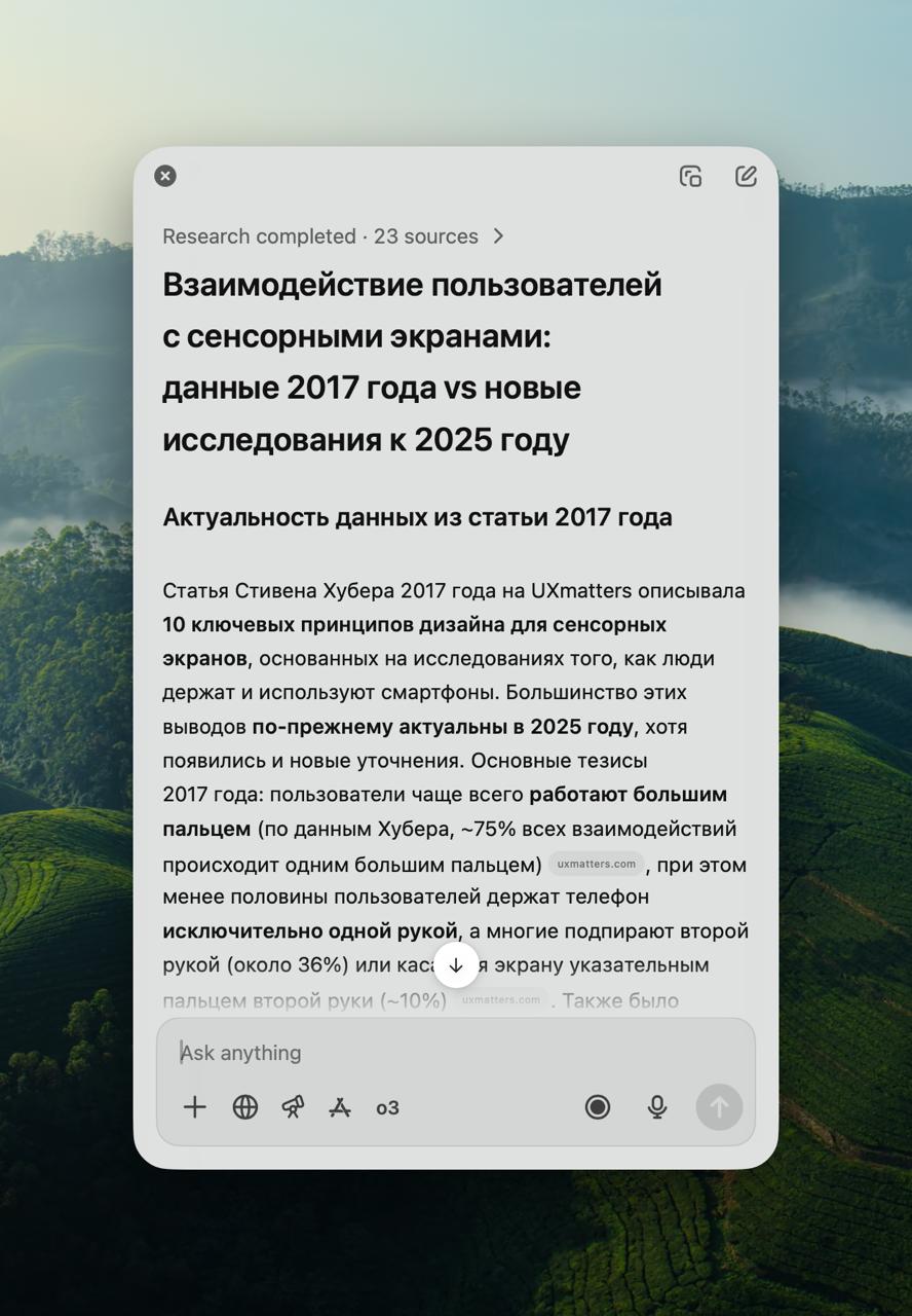
How people hold smartphones Lena, thank you for raising this topic in the comments to the previous note. This is my favorite topic for 2 re…
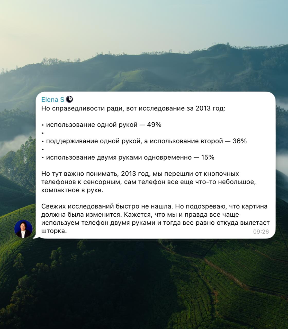
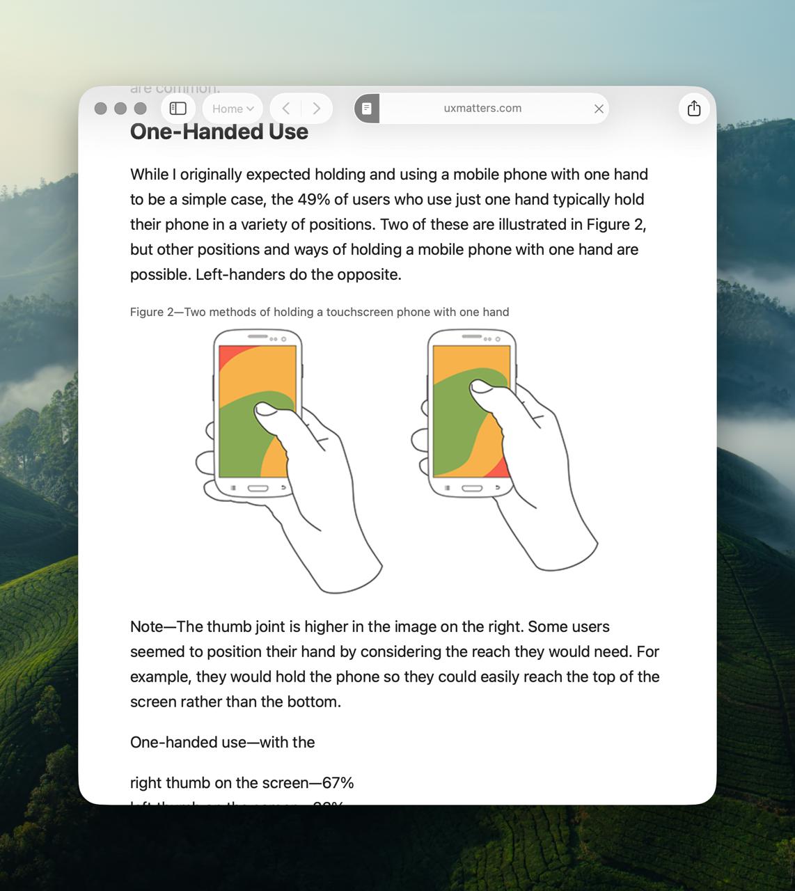
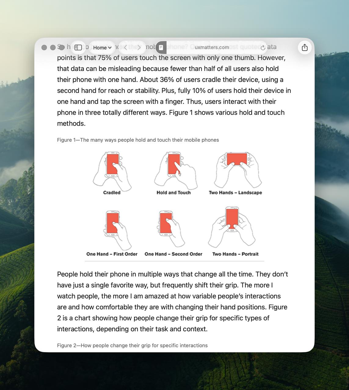
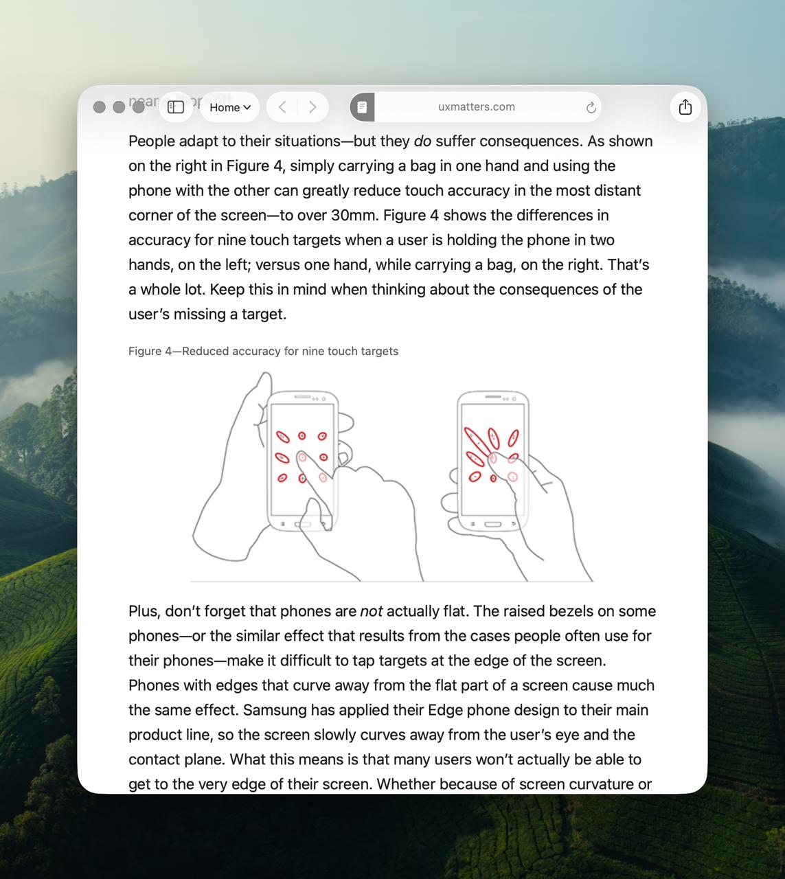
How people hold smartphones Lena, thank you for raising this topic in the comments to the previous note. This is my favorite topic for 2 reasons: - It shows the survivability of an informational meme-parasite - The author's persistence in getting to the truth You all know picture #2 and its interpretations. Every first respected designer with a blue checkmark on Twitter has a beautifully outlined version of this picture. Search results are flooded with it. Every second respected interlocutor appeals to the knowledge: "convenient under the finger" Thank you, Steven Hoober, for your work! Picture #2 is taken from the 2013 article How Do Users Really Hold Mobile Devices? We will not stop on it. We will go further. To 2017. Steven releases a substantial work consisting of three parts Design for Fingers, Touch, and People, Part 1 Design for Fingers, Touch, and People, Part 2 Design for Fingers, Touch and People, Part 3 Why, if it is so convenient to think that it is convenient to think "under the finger"... ...And that’s the problem with my old columns. I made some assumptions that were based on observations of the usage of desktop PCs, standards for older types of interactions, and anecdotes or misrepresented data. Come on, why are you starting, we were talking normally... One could probably think about why his work did not find the same popularity as the 2013 parasite. Maybe because the pictures are more complex? - So how do people hold the phone? - Who the hell knows! However they want! And where do they look? The upper left. The center or upward, and they keep scrolling the text for reading to the same eye location. Yes! They look where something interesting is shown to them But we are not in 2017, we are in 2025! And anyway, what am I paying for the internet for. I asked ChatGPT to conduct deep research to check the relevance of the articles: New data confirms the 2017 conclusion: the center of the screen is the most comfortable and accurate zone for taps Previously, it was widely believed that "fat fingers" (large diameter) cause errors, but the data refutes this - length and the related kinematics are more critical. Users still prefer obvious interactive elements - buttons, icons, links that look "pressable" The full GPT report Conclusions: Hoober's materials are relevant. And interaction design is better treated as always: the more obvious the interaction, the larger the controls, the greater the chances of success! People hold devices however they want. Let us also stop holding on to the old meme-parasite and finally let it go. Run, baby, you are free!