I like the consistency in the category design of Classical, the Apple Music offshoot. It has everything: minimalism, 3D, illustrations, and…
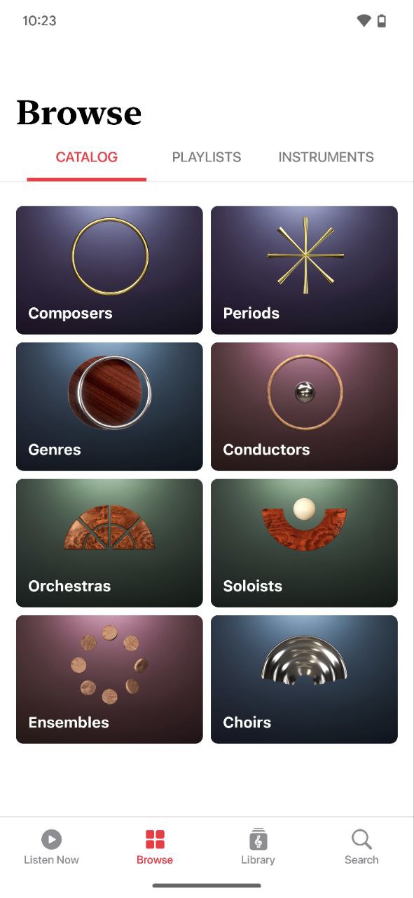
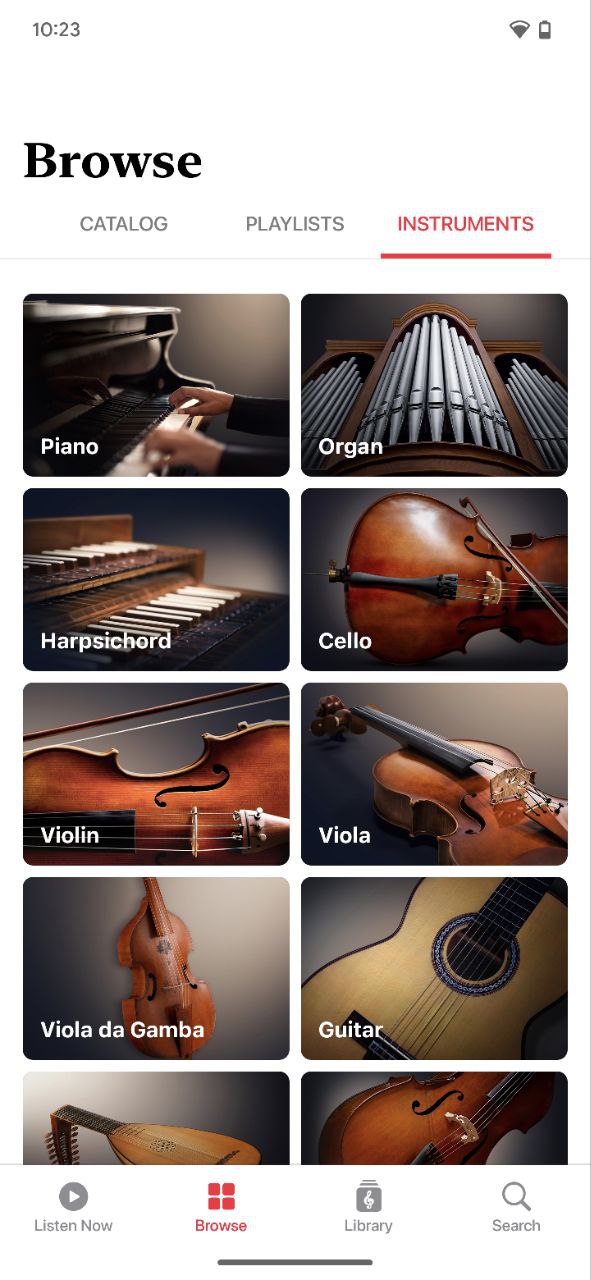
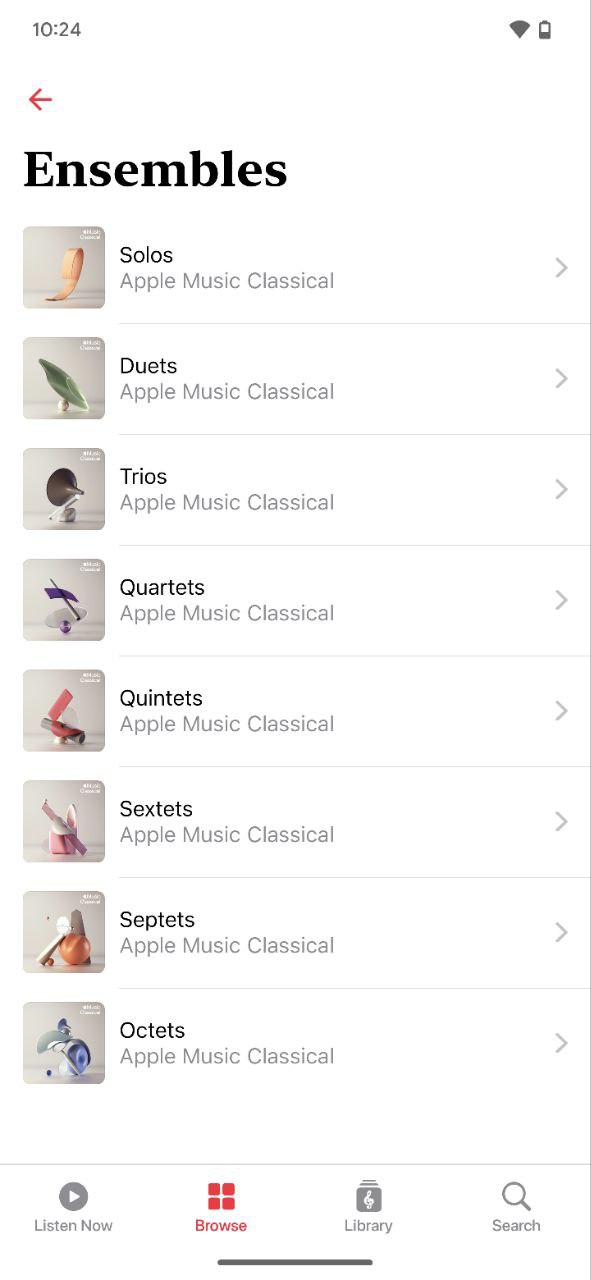
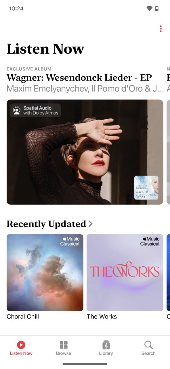
I like the consistency in the category design of Classical, the Apple Music offshoot. It has everything: minimalism, 3D, illustrations, and photorealism. They complement each other and create contrasts for a clearer signal about the different types of content inside. Contrasts manage attention, help the brain group objects, and help with navigation. There is also a curious contrast between the Music and Classical apps. It feels like one family. At the same time, one brother is an open-shirt guy for everyone and anyone. And you cannot just roll up to the second one that easily. The switch from the San Francisco grotesque to the New York serif works so strongly on perception. Funny that the cities after which the fonts are named are on different coasts. We have our own East Coast and West Coast here. After a conference in San Francisco, Danya Kovchiy shared an impression: event participants from the West Coast startup crowd use simpler words and wording in conversation. As if it is an endless pitch. Everyone needs to understand. Participants from the East Coast, from the world of finance and politics, express themselves in a more complex and intricate way. Maybe we are observing this effect in the screenshots.